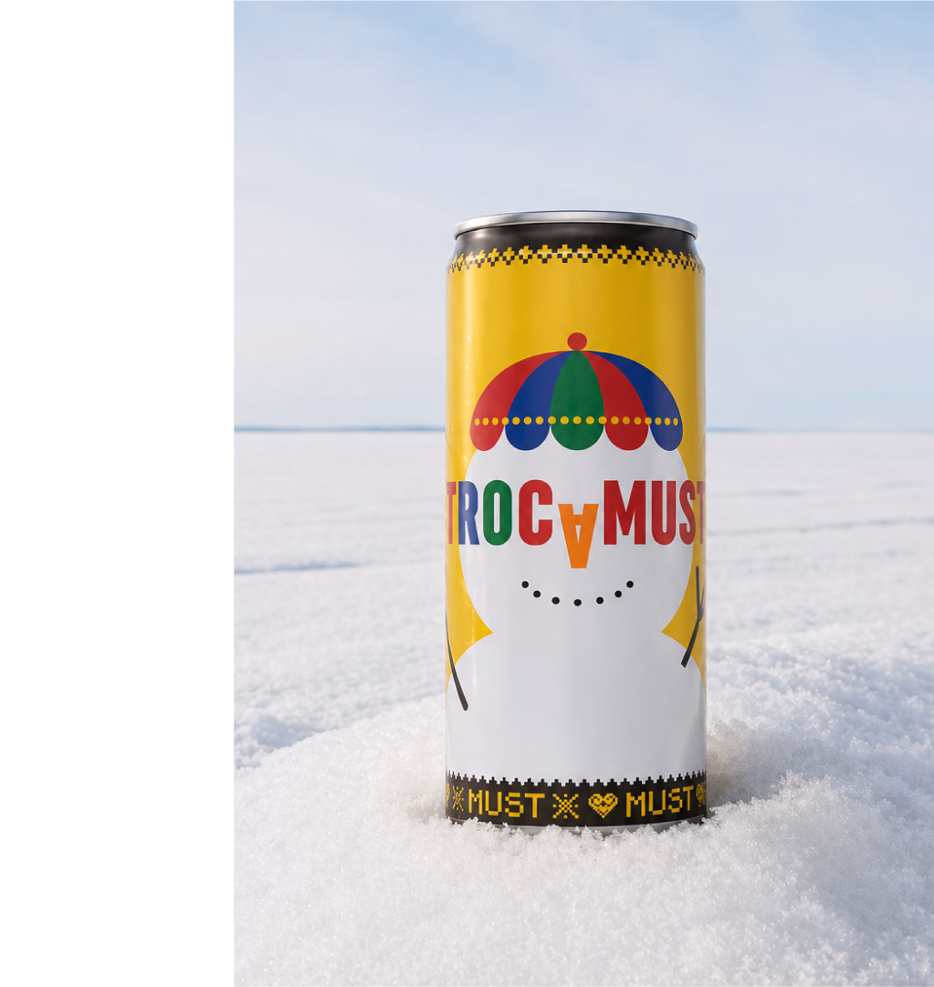
A new twist [br] on Trocadero
A beloved icon hadn’t been updated in years. A careful update of Trocadero Original’s design was made to stay relevant, as Spendrups set out to create a better, tastier Trocadero and refresh its design for a 2018 relaunch. At the same time, Spendrups launched Trocadero Zero. The challenge? Modernize without losing the soul of what’s often called Norrland’s national beverage.
Project
Trocadero Redesign
Client
Spendrups
Assignment
Visual Identity
Packaging Design
Package Implementation
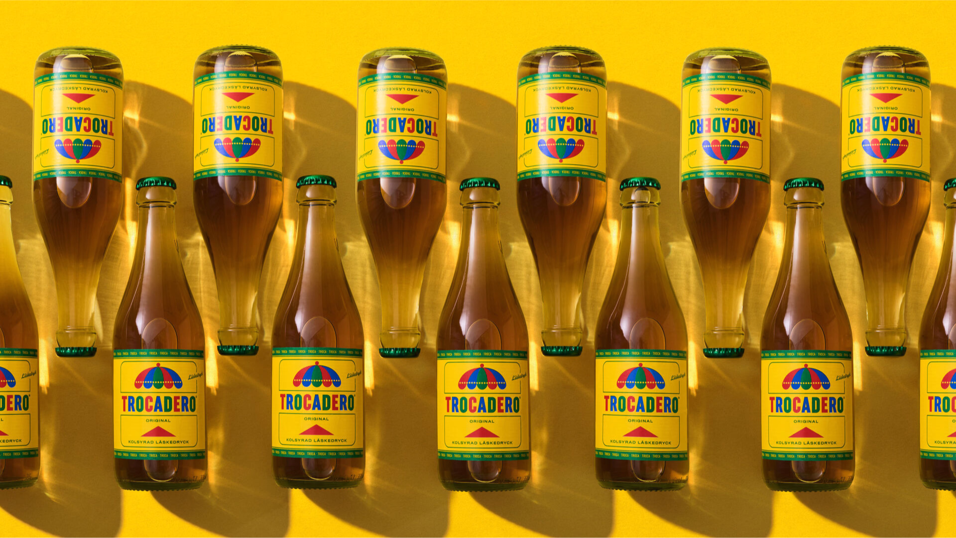
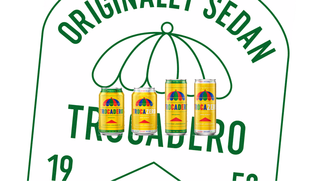
Not too sweet. Not too bitter. Not like anything else. Since 1953, Trocadero has been the soft drink that connects past and present – a taste of nostalgia, wrapped in colours that have become as iconic as the drink itself.

Before

After
Sharper. Clearer. Better.
By refining Trocadero’s design – with cleaner transitions, improved proportions, and more restrained graphic elements – we’ve made the packaging sharper and easier to spot on the shelf.

A fresh look with more flavour
With the new design, the light variant feels modern and relevant, while visually conveying a greater sense of taste than before.
Trocadero Zero quickly became Trocazero. When people make a brand their own, things tend to happen.
The power of the parasol
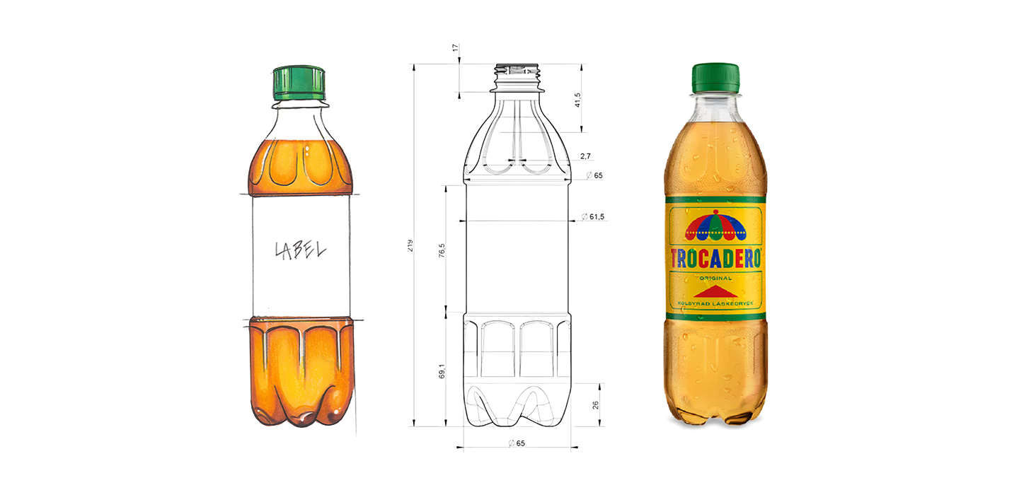
Few symbols say Trocadero like the iconic parasol. Instantly recognisable, it has become as much a part of the brand as the flavour itself. Why stop at the label? By embossing the parasol directly into the PET bottle, one of Trocadero's strongest assets becomes part of the pack itself. Distinctive to look at. Even better to hold.

Born in an era when everything felt possible, Trocadero borrowed its name from Paris but discovered its true flavor in Sweden. A drink that never needed flashy campaigns or bold slogans to win hearts – just word of mouth. Quite literally.

Trocamust launched in early autumn 2022 – a seasonal twist inspired by Sweden's beloved Christmas soda tradition. With its great flavour and winter-inspired design, it became a standout on the shelf. By year's end, it accounted for 72% of the category's growth.