VISUAL IDENTITY FOR SKÅNETRAFIKEN, REGION SKÅNE’S PUBLIC TRANSPORT
The visual journey of Skånetrafiken
Skånetrafiken needed an identity that could bring together public transport across the region – something clear, easy to use and built to last. The tricky part? It also had to fit within Region Skåne’s bigger structure. Neumeister’s solution combines a bold pattern with smart design elements that make travel simple and the brand easy to spot.
Implementation


Bringing it all together
When two counties merged to form Region Skåne, everything from healthcare to culture and infrastructure was brought under one umbrella – including Skånetrafiken, which is responsible for public transport. Skånetrafiken’s new identity had to fit within Region Skåne’s structure, with no separate logo and no risk of conflicting with the region’s own brand. The challenge was to create something that felt clear, confident and easy to recognise – without the usual tools like a standalone mark.


Designing direction
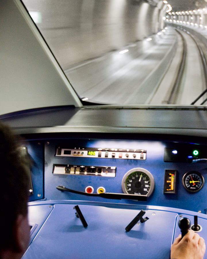
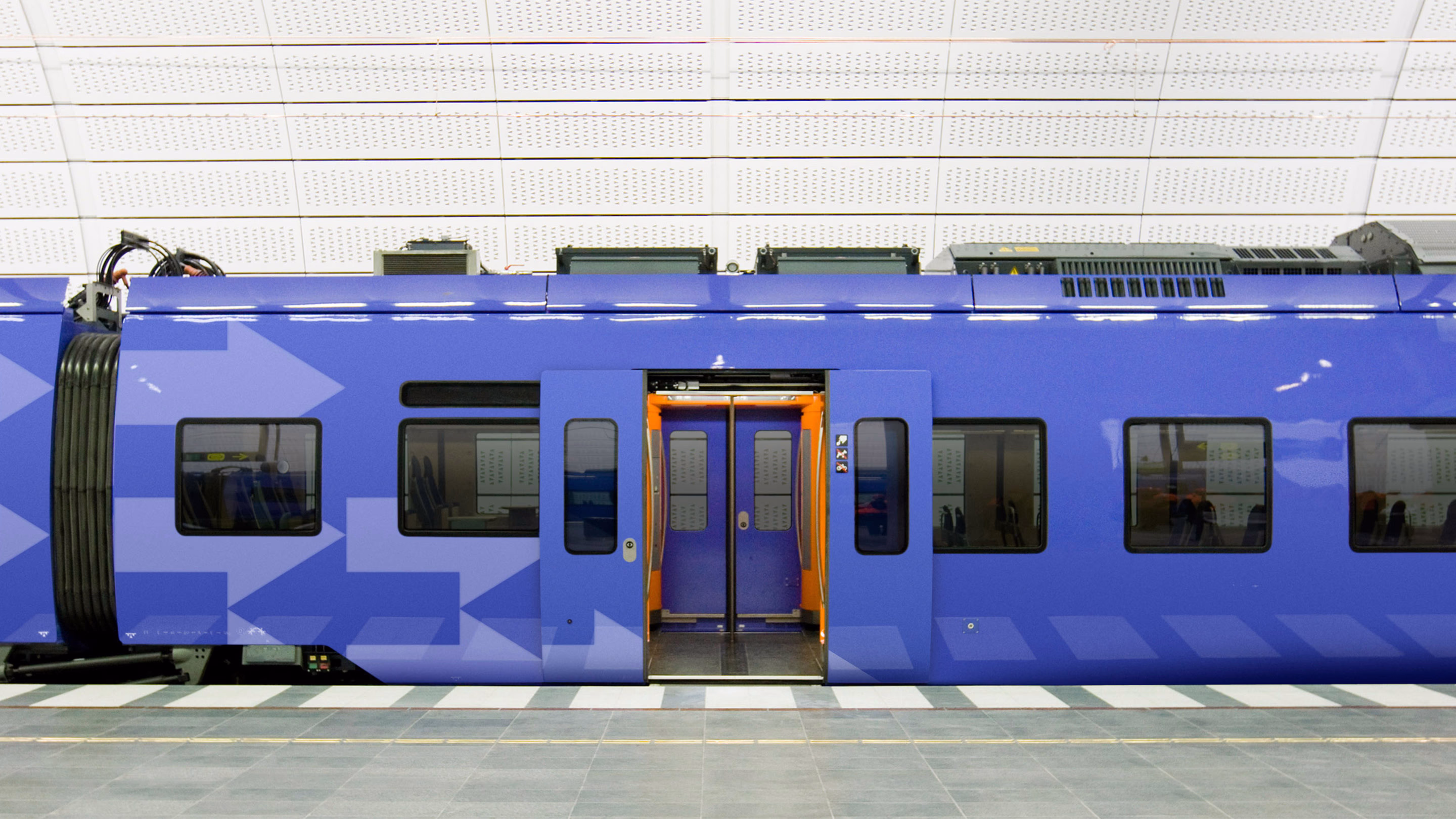
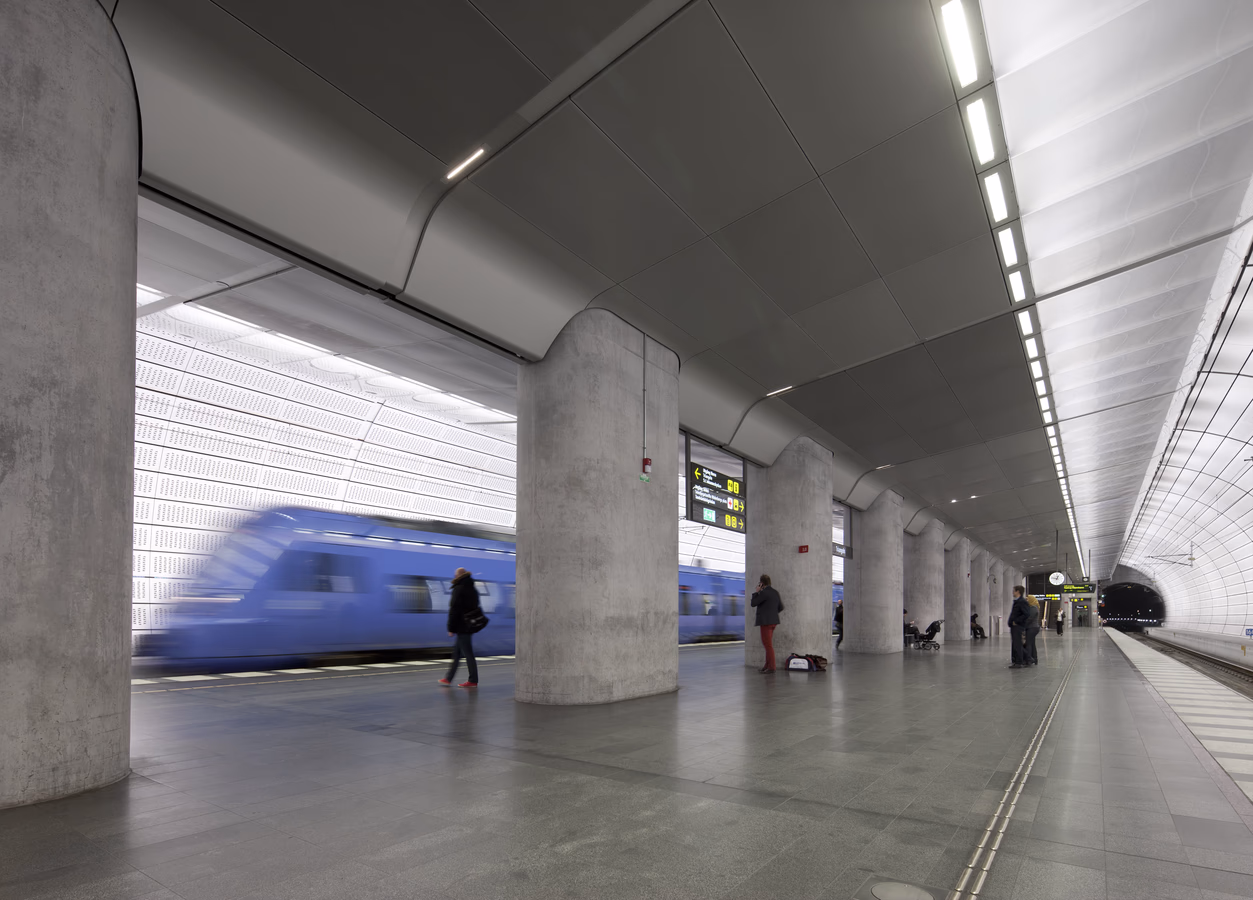
Without a logo to build on, Neumeister created a bold, graphic pattern that captured Skånetrafiken’s mission: taking people from A to B and back again. The pattern of opposing arrows became a unifying visual language – used across buses, trains, shelters, seat upholstery, travel cards, timetables and other passenger information. A design that makes the brand visible at every touchpoint – and reflects the values of effectiveness, clarity and reliability.

Navigating with confidence
Effective wayfinding was a core part of the design strategy. Beyond choosing Bosis—a sans-serif typeface optimized for legibility in urban settings—the system integrates clear signage, consistent colour coding and intuitive visual cues that help passengers navigate the network with ease. Together, these elements create a seamless experience guiding travellers from start to finish.
Everywhere you go
The pattern became part of the whole experience. It even appeared on travel cards, inviting passengers to imagine the journeys ahead.
Smooth travels
Colour remains a clear and consistent guide throughout the design, woven into vehicles, signage and timetables. A smart system that makes travel easy and intuitive, guiding passengers before, during and after their journey.
Colours of clarity
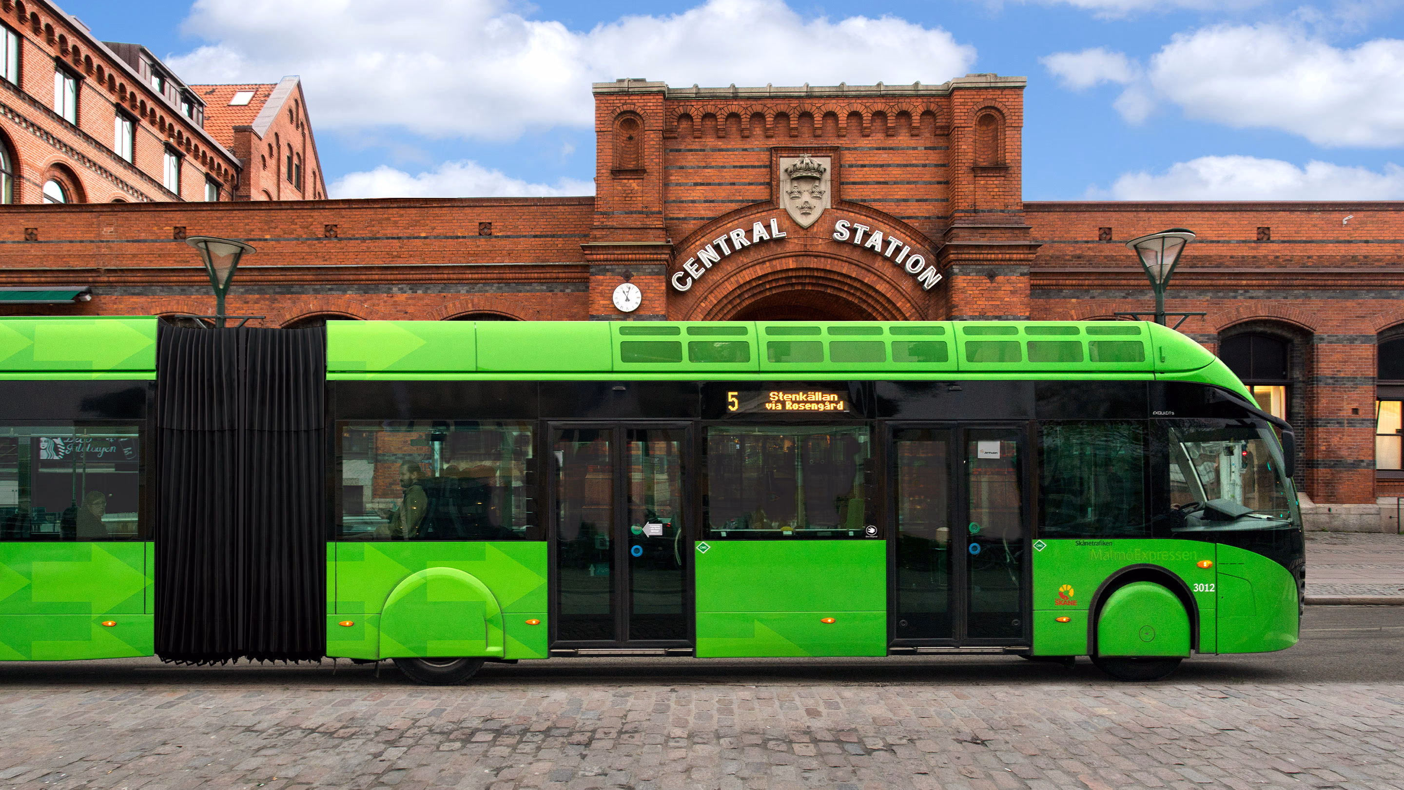
Neumeister proposed a system inspired by Skåne’s own colours: red for shorter city journeys and yellow for longer regional routes. A simple logic that linked services to geography and helped passengers find their way. However, Skånetrafiken chose to keep some existing colours and settled on green for city traffic, yellow for regional traffic and purple for Pågatågen.


Expanding the journey
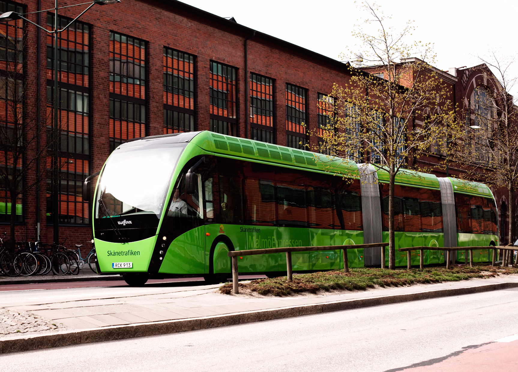
Over the years, the assignment has grown to cover new modes of transport. From Lund’s trams and SkåneExpressen’s buses—designed for high comfort on longer journeys—to MalmöExpressen, Europe’s first 24-metre electric buses.
Inspired by illusion
What better way to show movement than with a pattern that never stands still? Inspired by M.C. Escher’s clever play with positive and negative space, we made the arrow design the heart of Skånetrafiken’s identity – a visual trick that keeps catching new travellers’ attention.