Designed for [br]the game
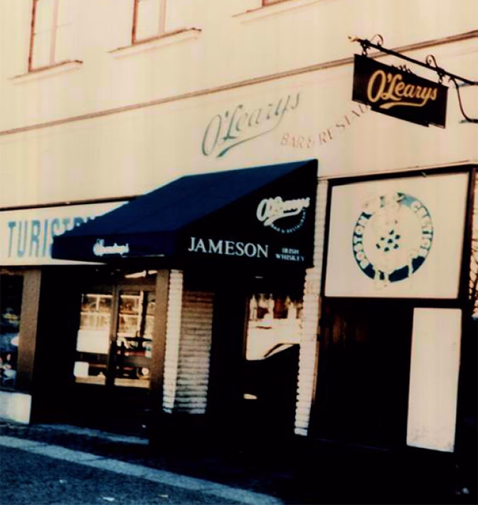
In 1988, Sweden’s first American sports bar opened its doors at Basargatan 10 in Gothenburg. Inspired by a Boston neighborhood bar, O’Learys became the go-to spot for sports, American food, and good times. After decades of success, it was time to modernize and refine the visual identity.
Project
O'Learys Redesign
Client
O'Learys
Assignment
Brand Strategy
Visual Identity
Implementation
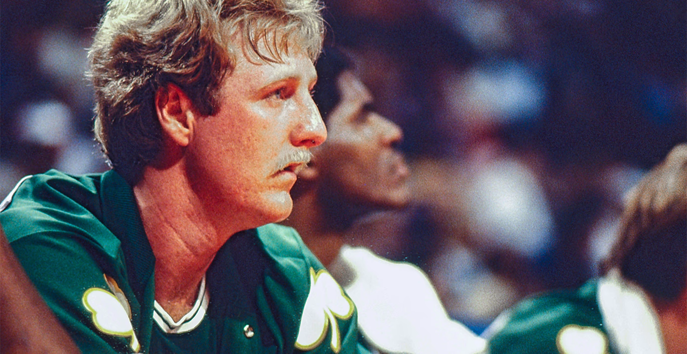
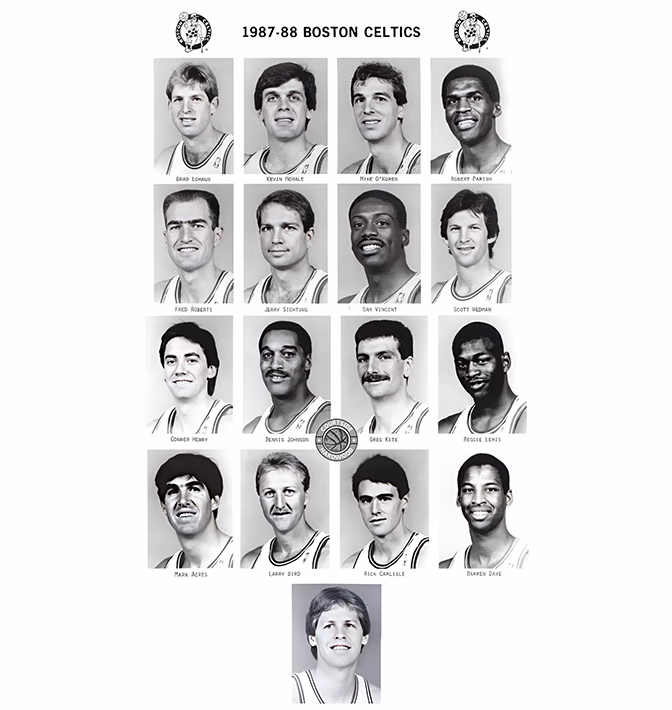
Green for the Celtics, green for Boston’s Irish roots – the color choice was a no-brainer. A vibrant yellow as a secondary color adds the just the right dose of joy and energy.
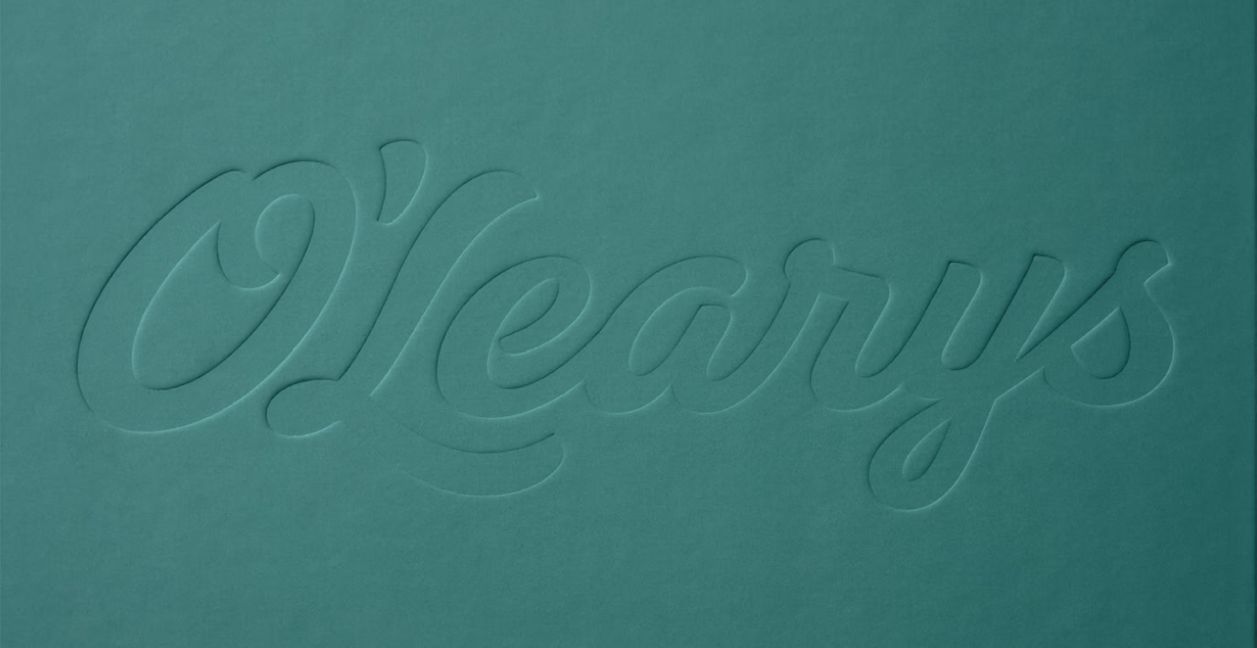
New logo for a new game
We stripped away the clutter – outlines and unnecessary details – and switched to a classic baseball script that instantly signals sports and the spirit of the USA.
Before
After
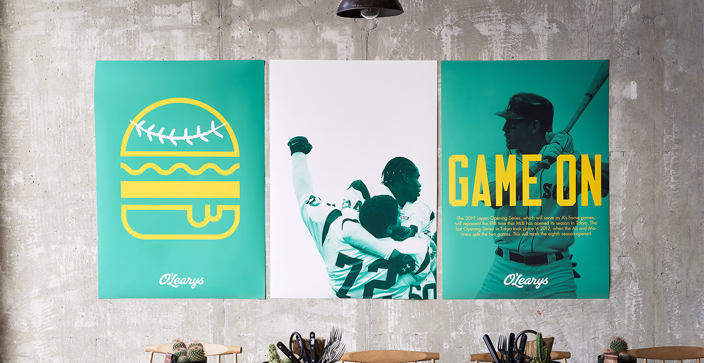
O’Learys is where sports and good food meet. This was captured in a playful way through bold, eye-catching pictograms, where an ice creamcone can transform into a basketball hoop, and a hamburger can playfully take the shape of a football.
History you can hold
Home to the Celtics, TD Garden has been a witness to some of the biggest moments in basketball. History has been made between those walls and the soles of legends have walked, run and jumped over every inch of that old parquet floor that sits in its centre. It holds the blood, sweat and tears of hard fought victories and devastating losses, and when it came time to replace the floor, O’Learys was honoured to receive part of this incredible piece of history and be able to share it with the people that had played a part in shaping its own.

Fair, passionate, and proud – these are the values of O’Learys. With a visual identity that captures the adrenaline and the atmosphere, the cheering crowds and the roar when the ball hits the back of the net, we bring it all to life.