Oddnorm twists [br]the familiar
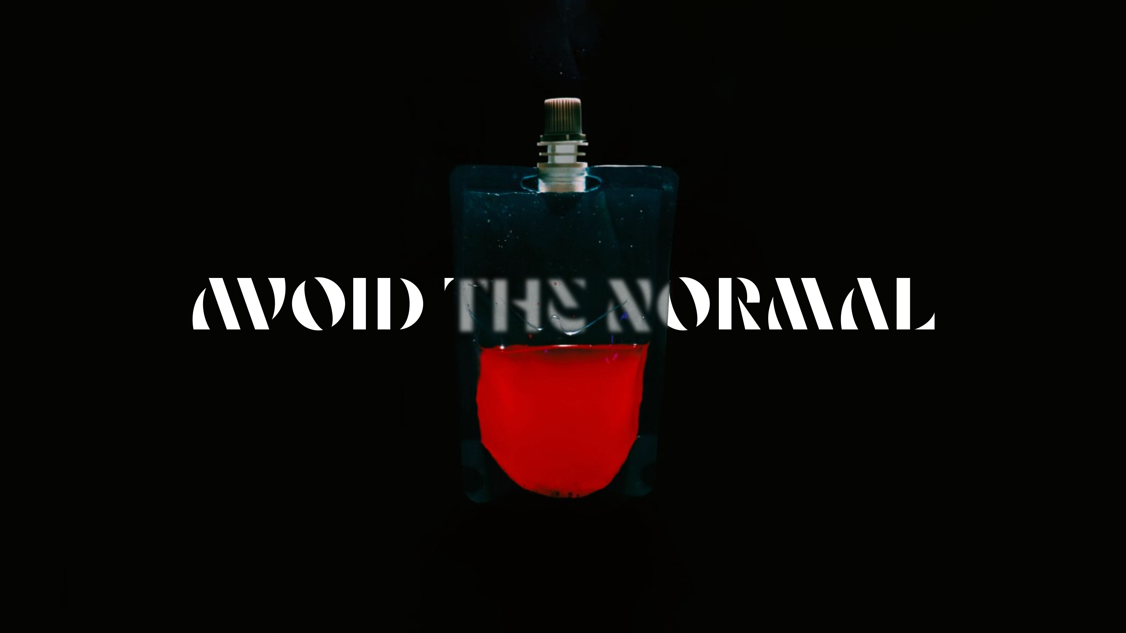
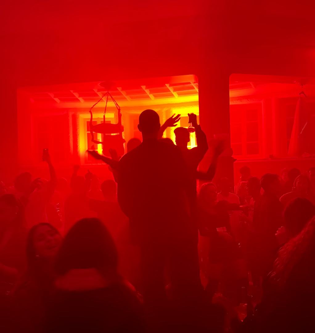
A pop-up that refuses to behave. For Oddnorm — the Nordics’ first full-sensory dining experiment, Neumeister has created an identity sharpened with intent: bold, ambiguous and deliberately asymmetric. A visual system that twists the familiar into something thrillingly unknown.
Project
Pop-up Restaurant
Client
Oddnorm
Assignment
Brand Strategy
Naming
Visual Identity
Custom Typeface
Motion Graphics
Implementation
Designed to unsettle
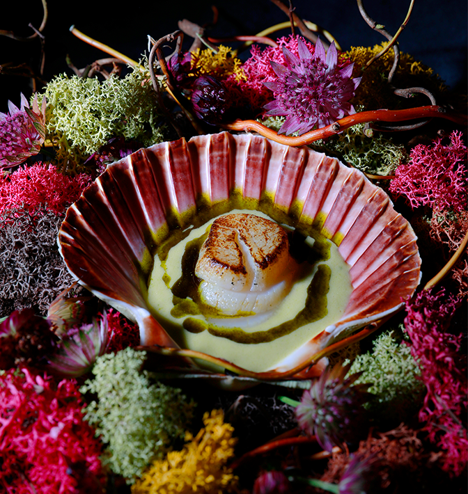
Oddnorm was never meant to read as a restaurant. It is a four-week encounter where fine dining meets technological and artistic intervention — a temporary world built to shift, flicker and reset expectation.
Nothing about Oddnorm behaves as expected; each edition takes on its own form. Our task was to create a visual identity that could mirror that unpredictability while maintaining a clear sense of control.
Shaped by collaboration
Behind Oddnorm are the creative hub Doubble Space, the event agency No Normalcy , the fine-dining restaurant Persona and Neumeister— four perspectives united by the ambition to challenge Stockholm’s dining expectations.
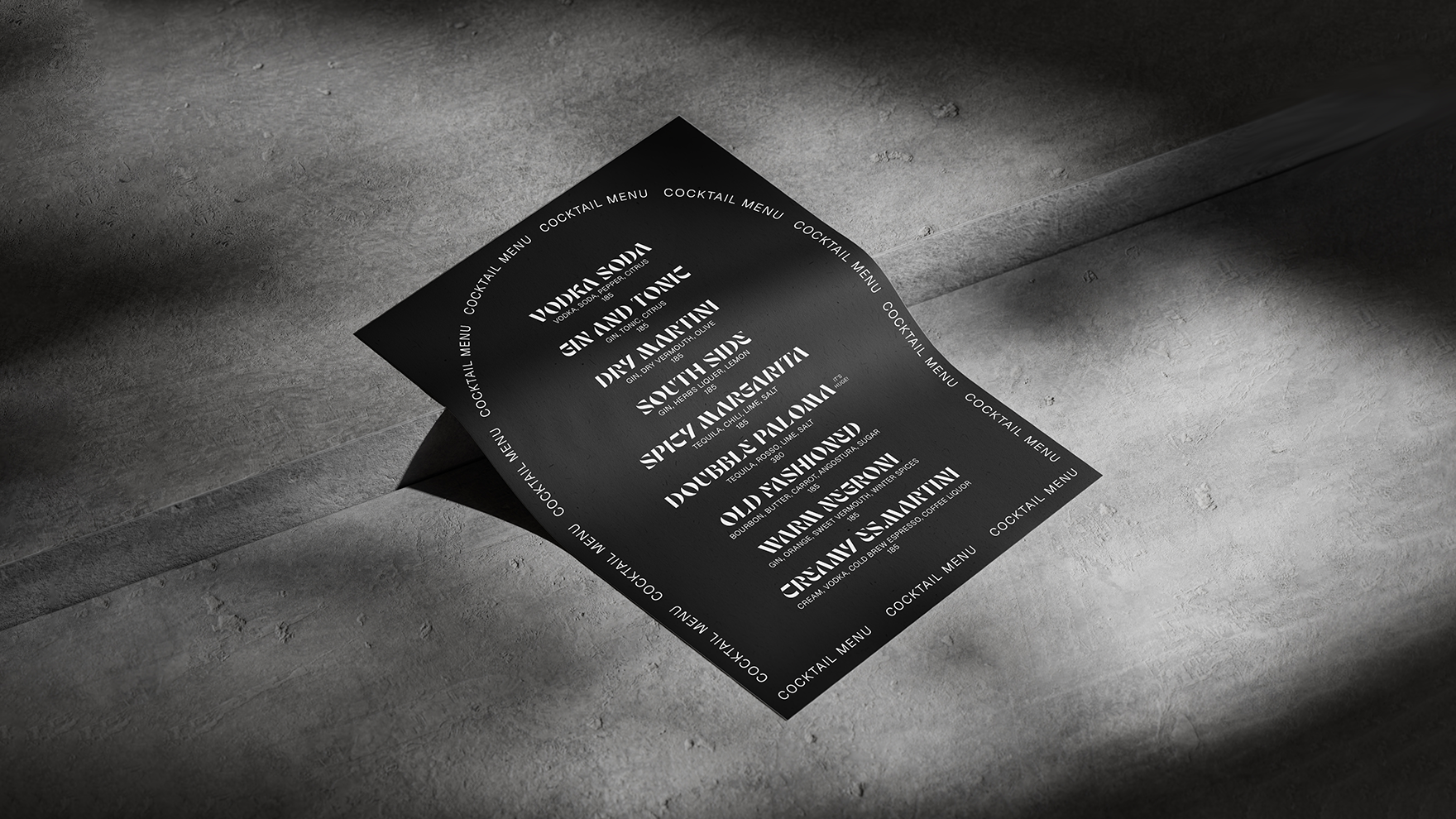
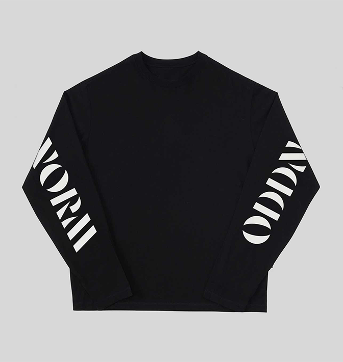
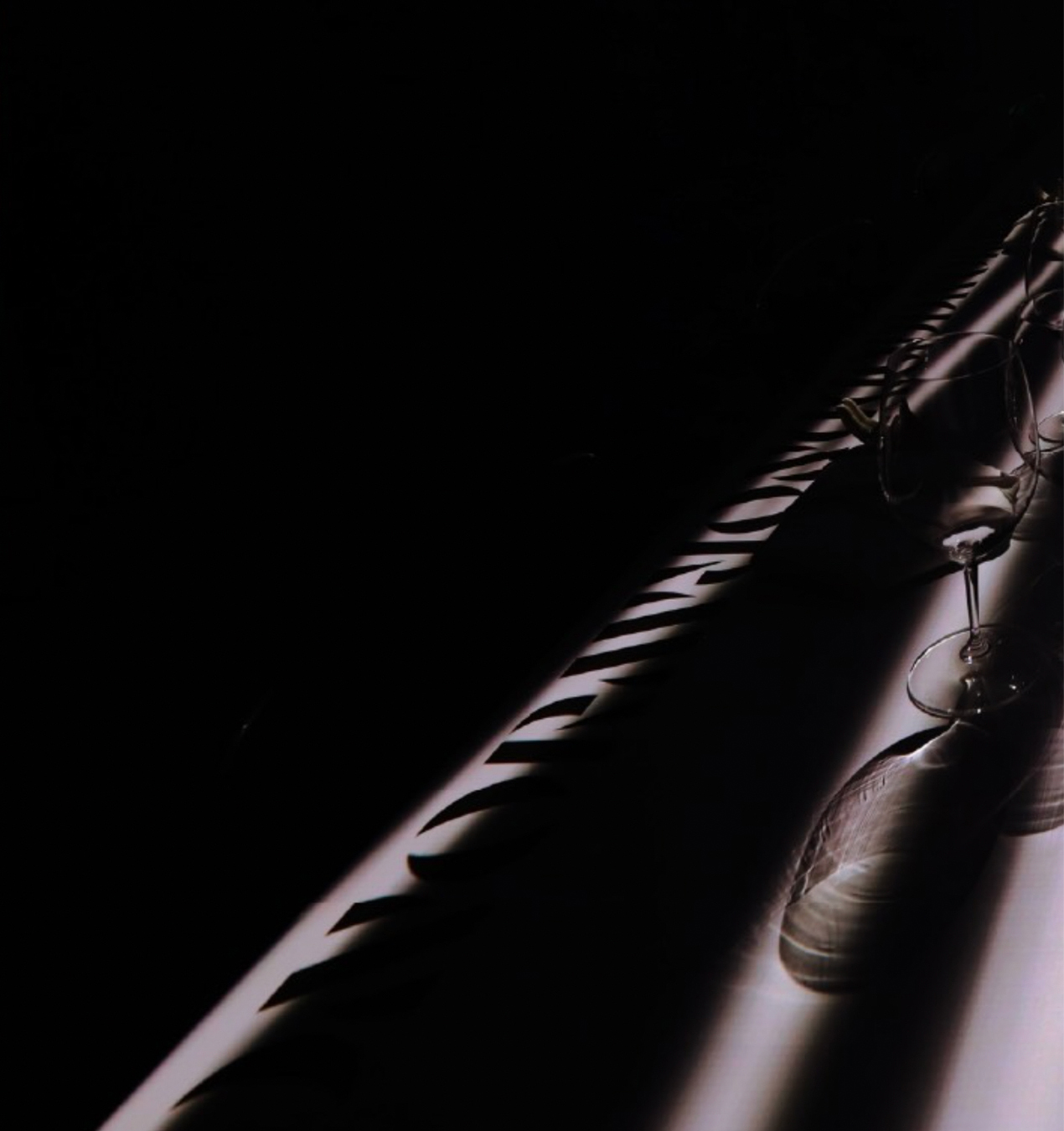
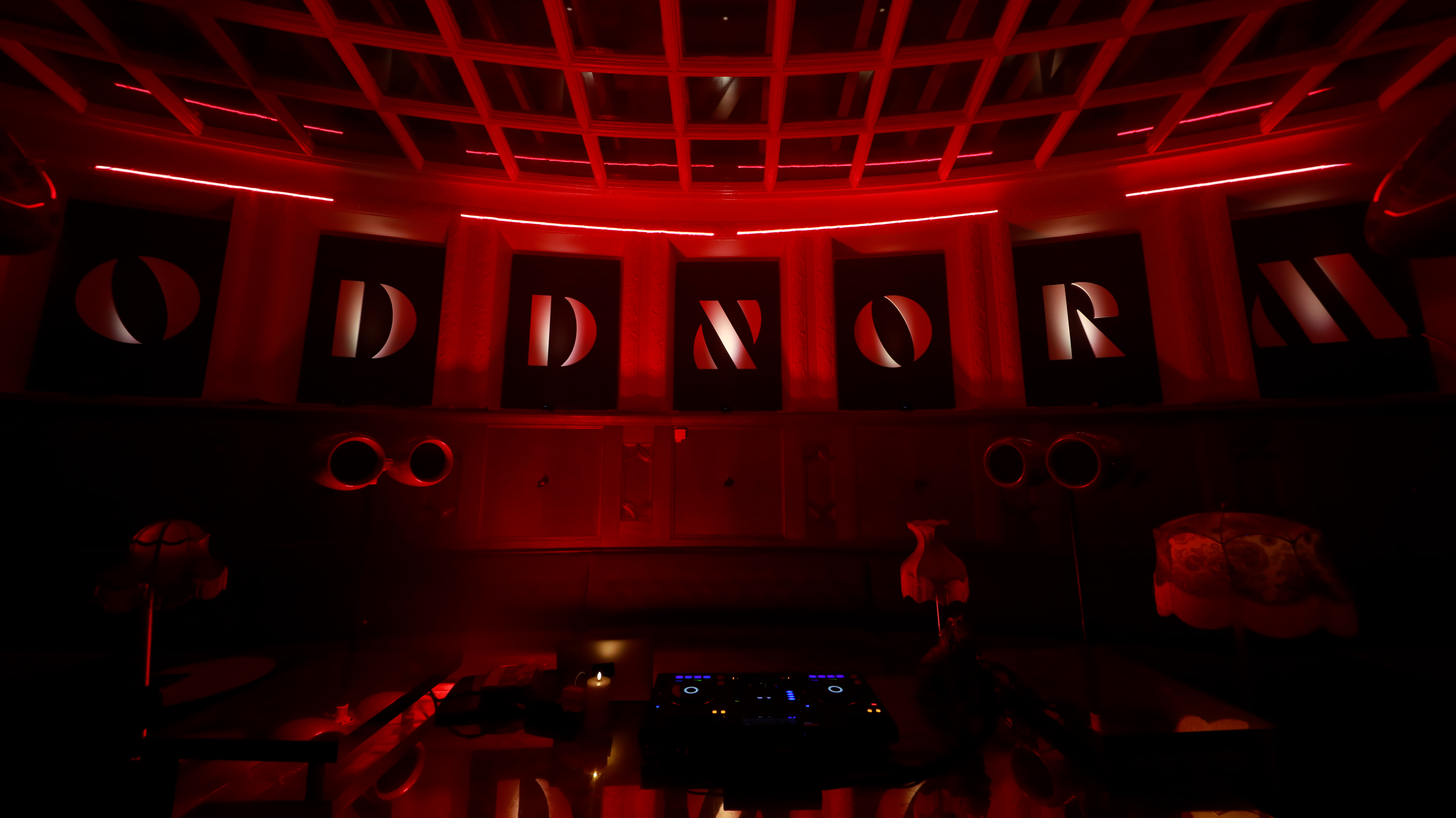
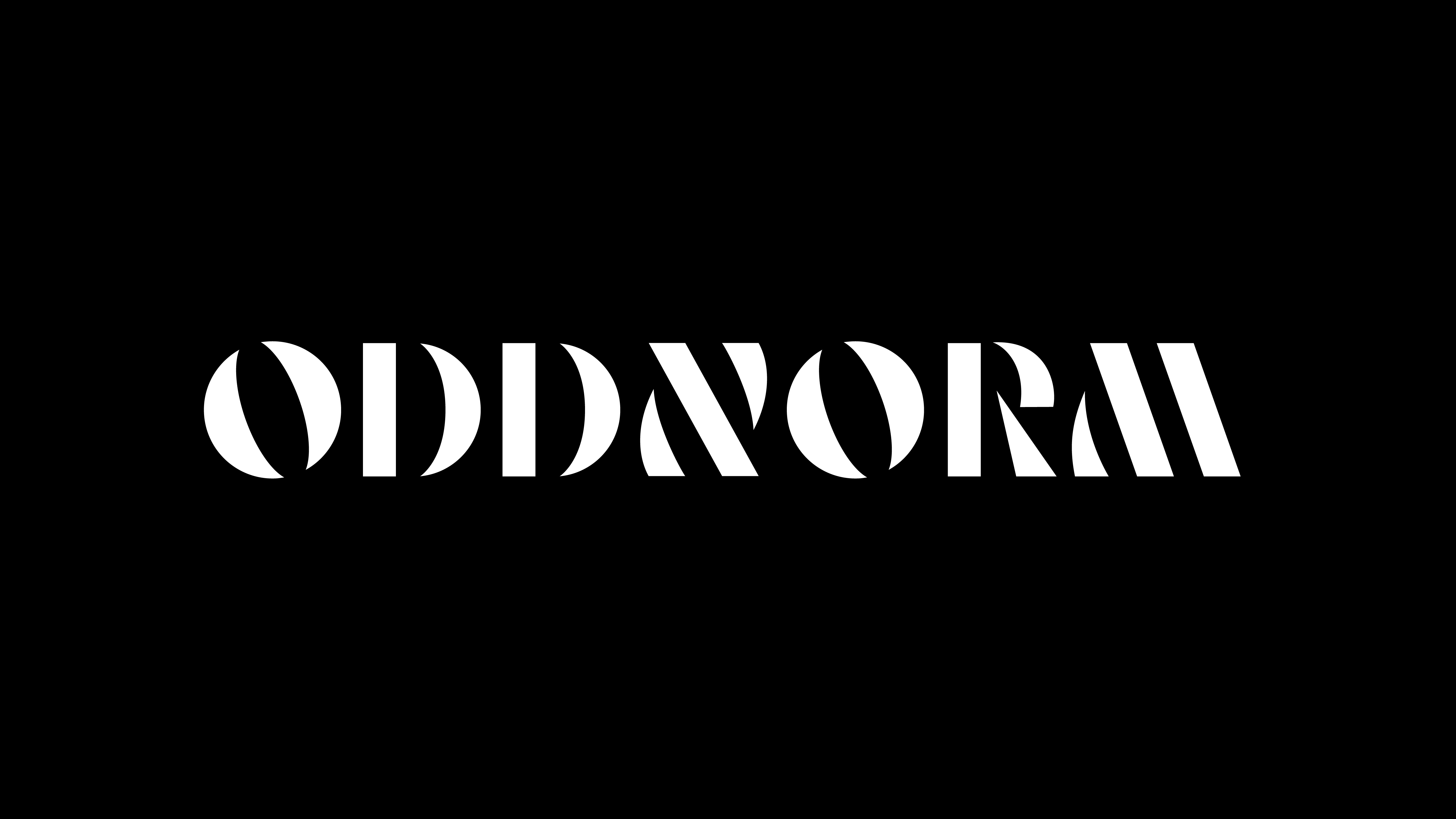
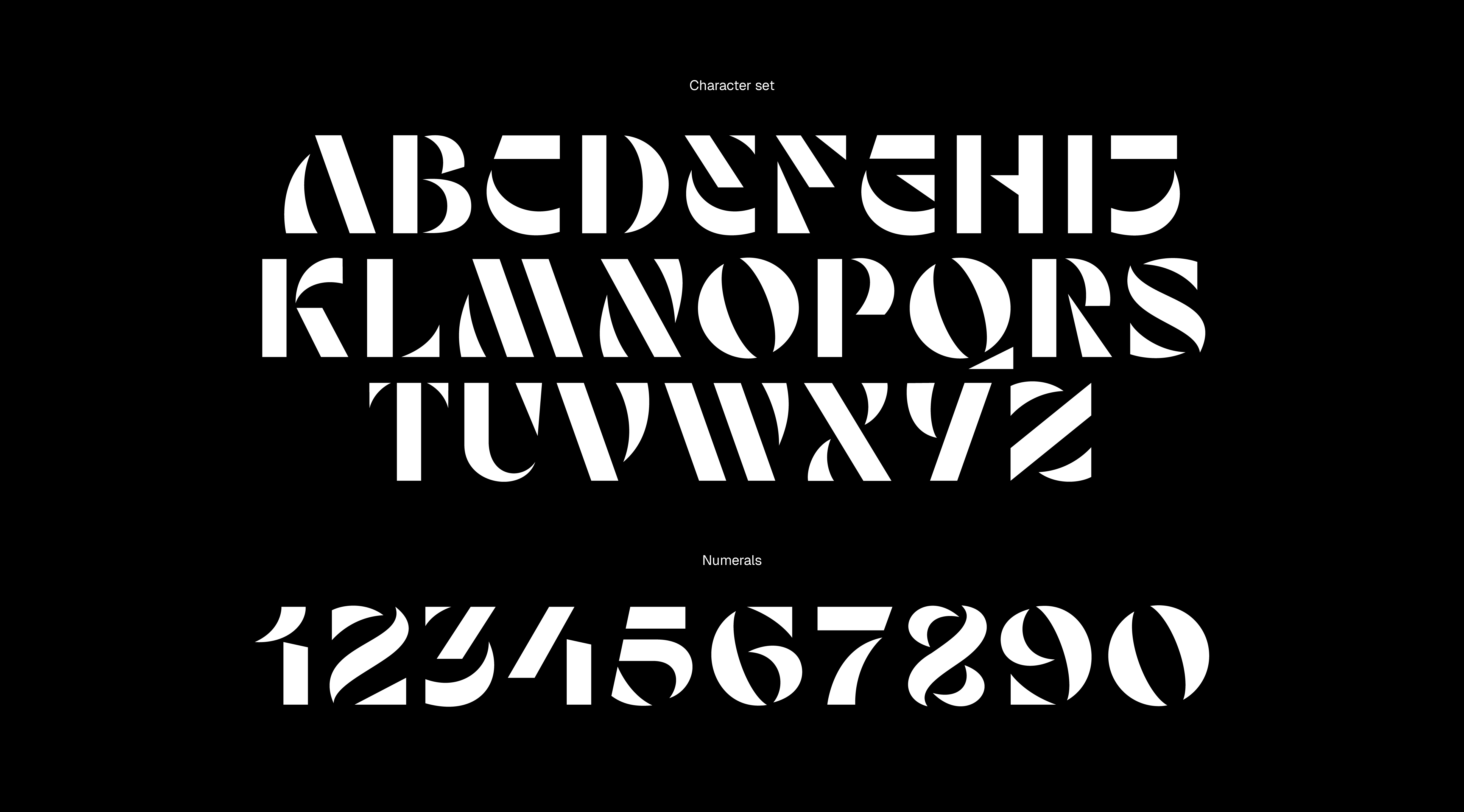
Crafted from a custom typeface
The identity is built from a custom typeface — a bespoke font that becomes both the foundation and the expression of Oddnorm. Designed with intentional ambiguity, its letterforms feel familiar but never entirely predictable.
The approach mirrors the dining experience itself: layered, mysterious, and requiring active engagement to fully comprehend. Not everything is meant to be understood at first glance.
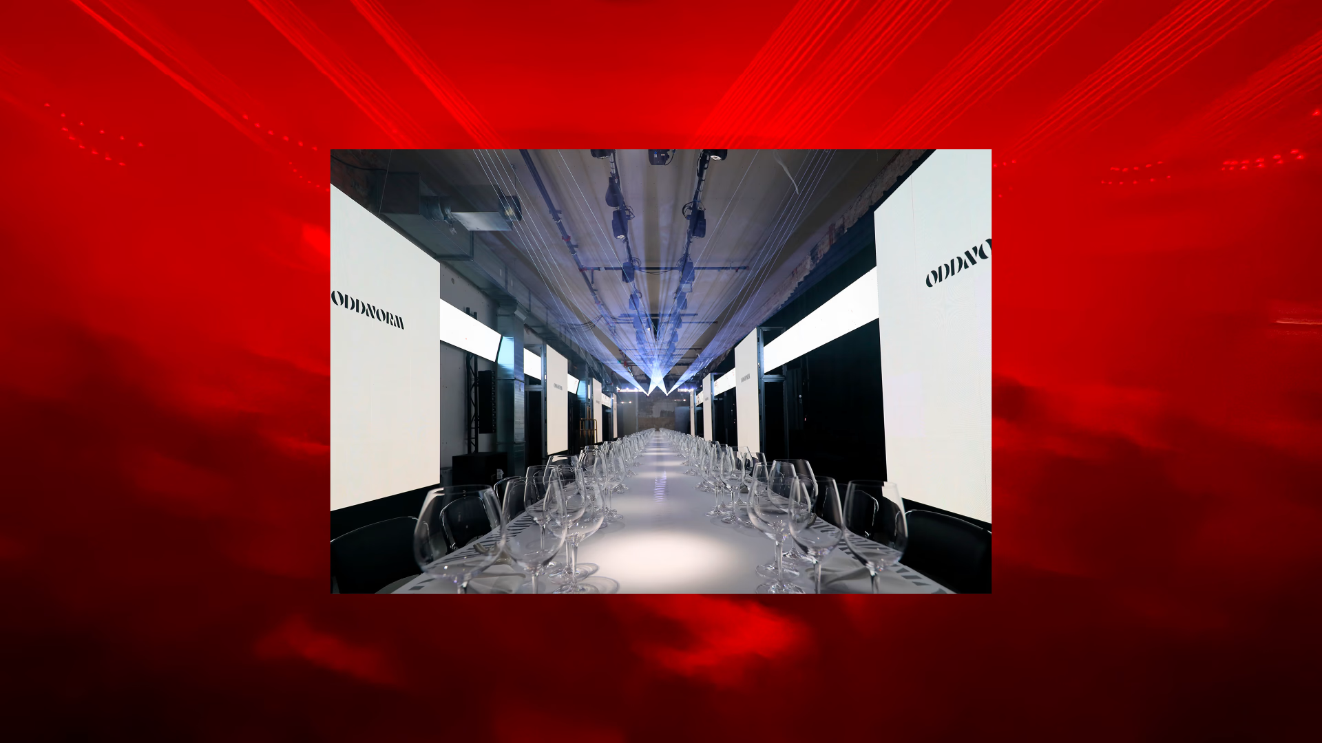
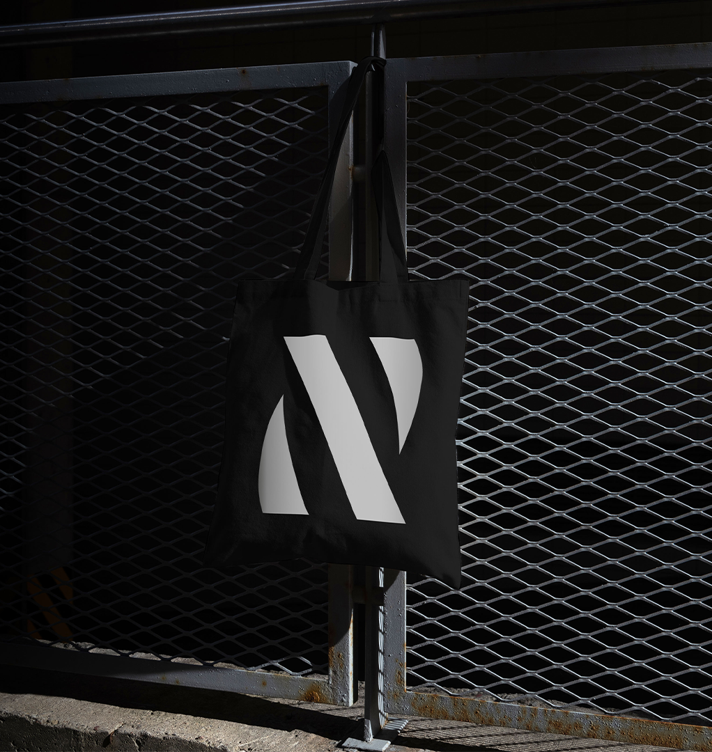
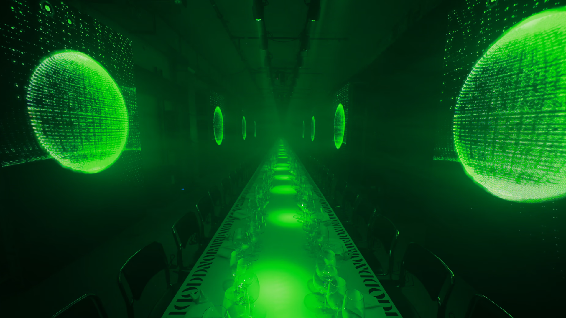
Used across print, screens and motion, it introduces a gentle twist that keeps the expression from settling. It anchors the system while giving it a distinct sense of movement, even in its simplest applications. The same clarity carries through every touchpoint, from menus and table pieces to merch.
The rotated N