Carving [br]a new path
New products, new markets, new opportunities. For Morakniv, a period of growth called for a new visual identity – one that honored the past and pushed towards the future.
Project
Morakniv Redesign
Client
Morakniv
Assignment
Visual Identity
Packaging Design
Packaging Implementation
_result.avif)

A cut above
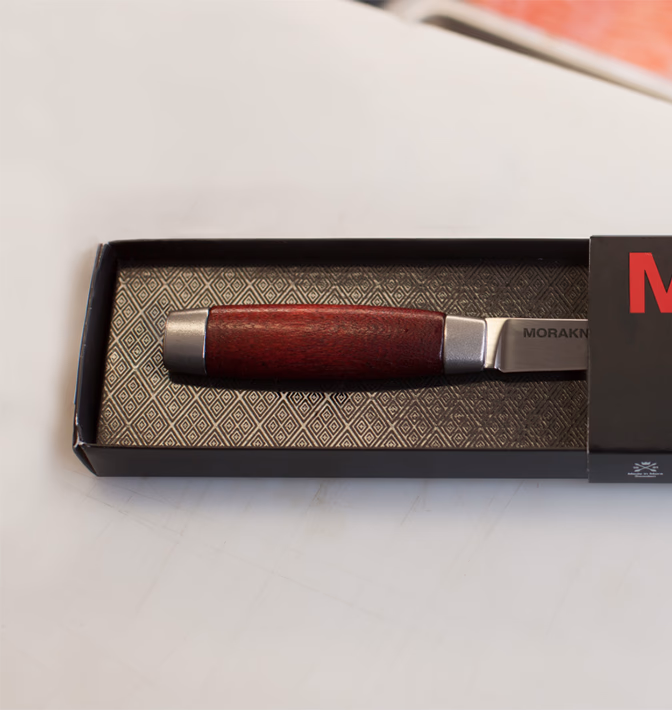
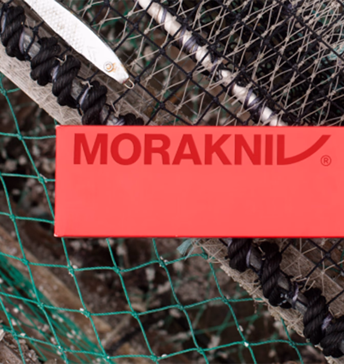
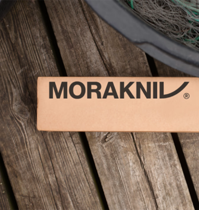
Morakniv’s new logo is a graphic interpretation of the brand’s classic knife, featuring the handle’s iconic Falu red and the blade’s steel gray. The stylized “V” at the end of the name curves upward, echoing the shape of a knife blade. Like Morakniv knives, the typeface is strong, simple, and direct.
The power of pattern
Patterns are a powerful part of identity, creating visual cohesion and making a brand instantly recognizable. Morakniv’s pattern is inspired by handcrafted leather sheaths and traditional motifs from Dalarna.
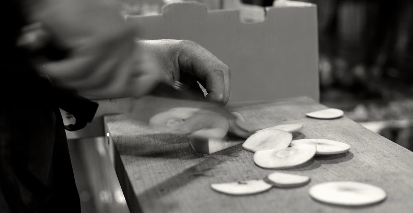
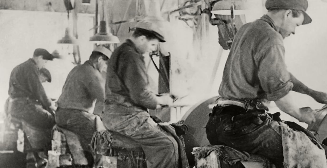
Since 1891, Morakniv has been a symbol of Swedish craftsmanship, combining the art of knifemaking with modern precision. As a trusted Nordic knife brand, Morakniv has earned its place as the go-to choice for durability – trusted by outdoor enthusiasts and skilled craftsmen.

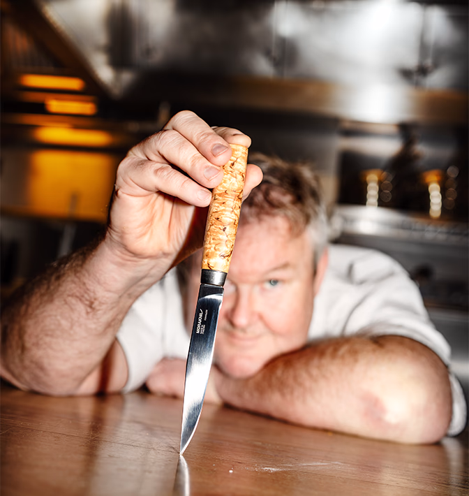
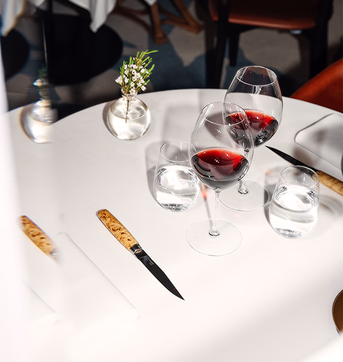
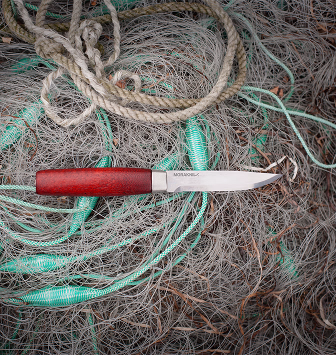
Authentic photography style
Carefully curated photography pays tribute to the landscapes around Mora in Dalarna, where Morakniv knives are made. In advertisements and on packaging, coordinates for longitude and latitude are included – all to enhance authenticity.
With new packaging design, floor displays, signage, catalogs, brochures, posters, and countertop stands, the Morakniv brand boosted its in-store presence, making it more visible and accessible to customers.