Designed to break away
Klint isn’t your average nicotine pouch. It's white, tobacco-free, and made to fit a modern lifestyle – clean, active, on the move. But as competition grew louder and global ambitions bolder, it was time for a redesign that could keep up. Neumeister was brought in to sharpen the identity, refine the packaging, and give the brand the visual impact it needed – not just on shelf, but on the racing circuit too.
Project
Klint Redesign
Client
Habit Factory
Assignment
Visual Identity
Packaging Design
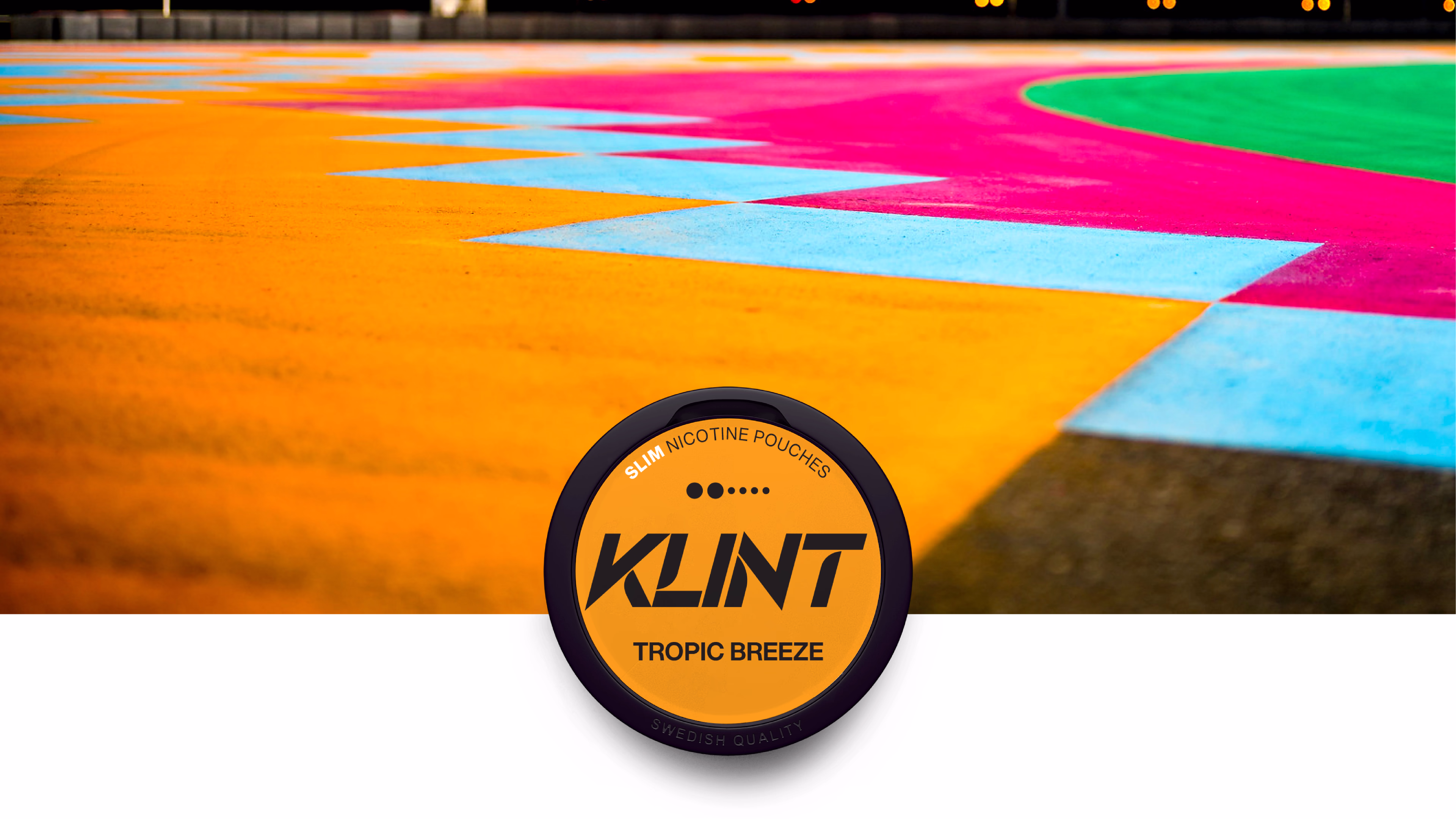
Born in Sweden and developed by Habit Factory, Klint is shaped by a mindset of precision, passion and the will to challenge convention. The goal from the outset was clear: to create a premium, tobacco-free pouch that delivers a clean nicotine experience with style. Available in slim or mini portions, Klint comes in a wide range of strengths and flavours – from icy mint to tropical blends – made to suit a global, health-conscious audience on the move.
Motion in every letter
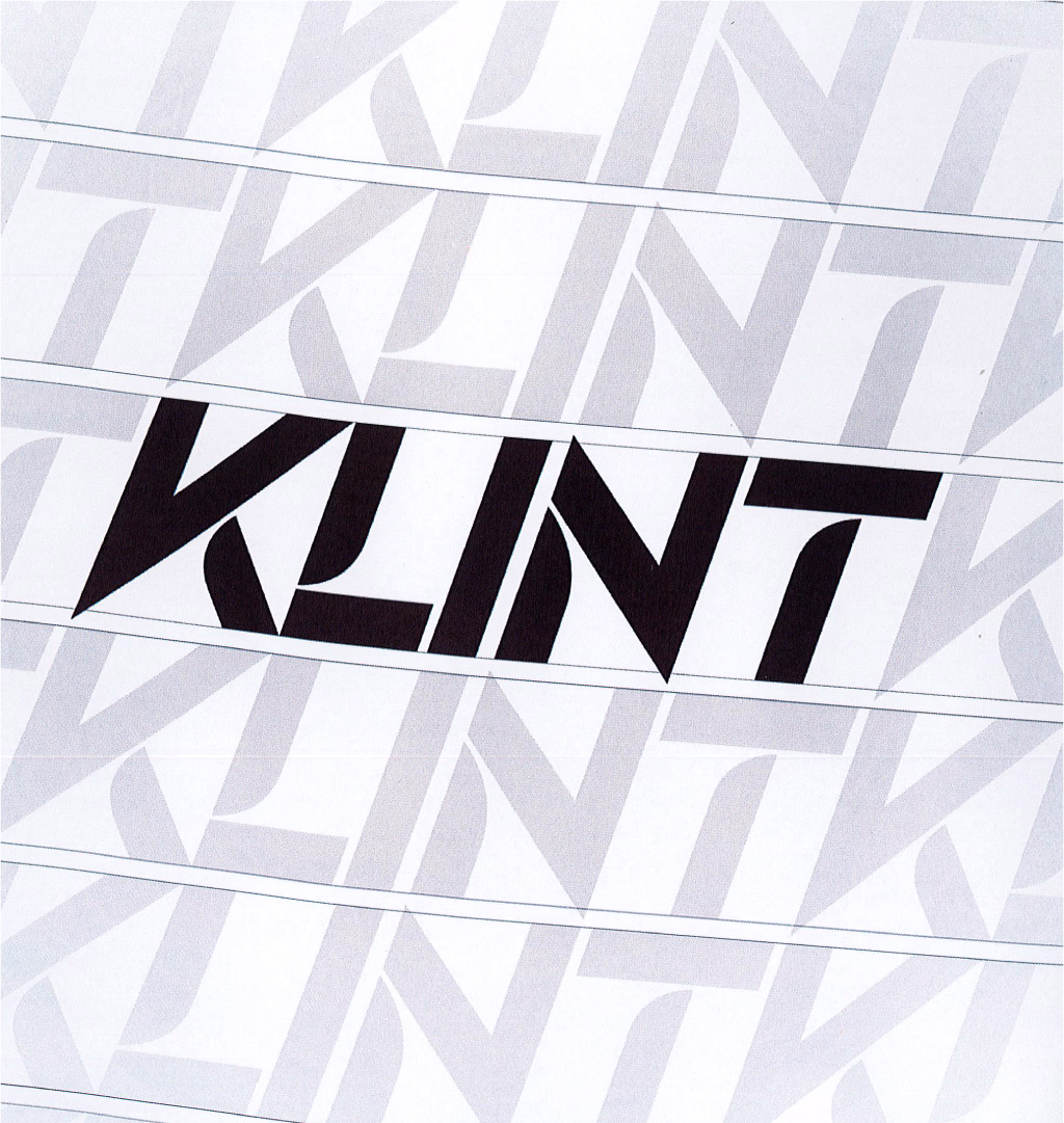
The wordmark was completely reimagined to convey motion, strength and precision. Built on a custom typeface with cut angles, directional shapes and a subtle forward tilt, it captures the speed and confidence at the core of the brand. It’s instantly recognisable, works across formats and surfaces – bold, clear, and unmistakably Klint.
A graphic pattern is created by repeating the KLINT logo in straight lines,
adding a sense of speed and direction that amplifies the brand’s dynamic character. It’s a design element built for instant recognition – at any scale.
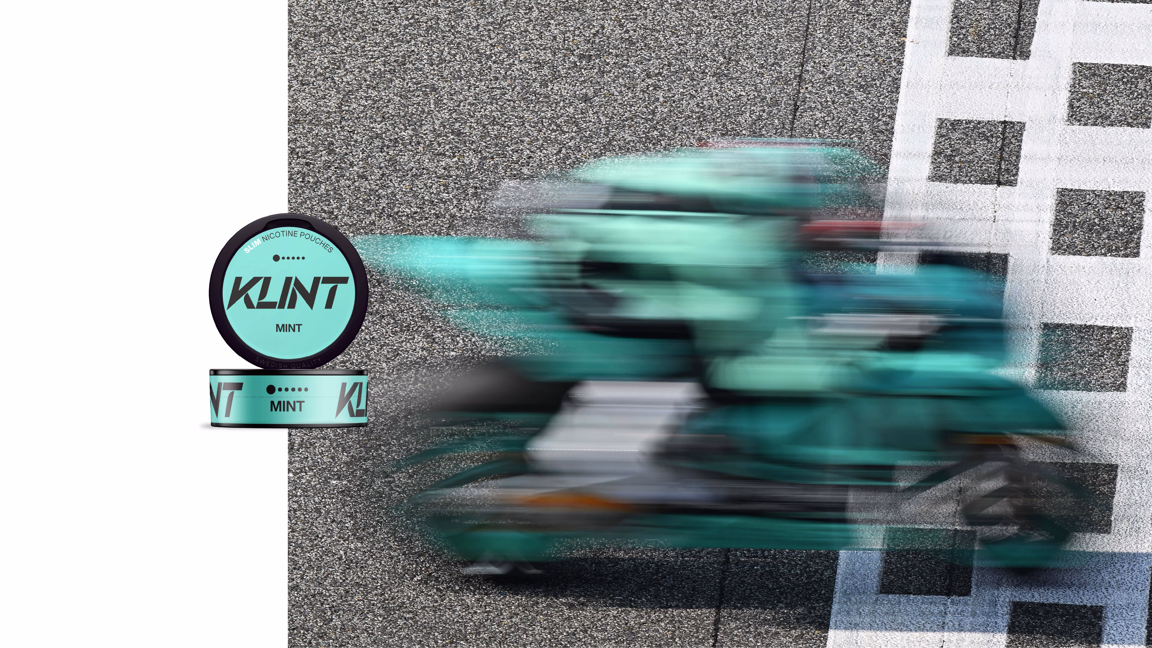
Order in the mint chaos
Polar Mint. Freeze Mint. Breeze Mint. The flavour range may be dominated by mint, but each variant needed its own space – and its own shade. We developed a colour system that signals mint across the board, while giving each can a clear, distinctive character. To bring clarity to an extensive portfolio, we also introduced a sharper hierarchy: brand first, flavour second, strength third.
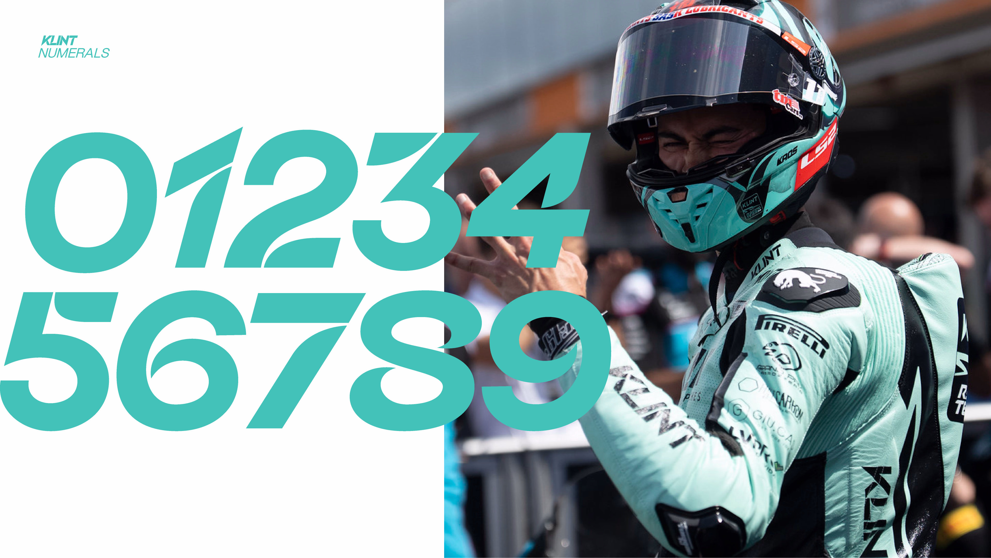
A typeface that speaks Klint
Aspekta gives Klint a modern, contemporary look that works seamlessly across every touchpoint – from packaging to print and digital. With its wide range of styles and sizes, it remains clear and legible in everything from the smallest details to large-scale applications.
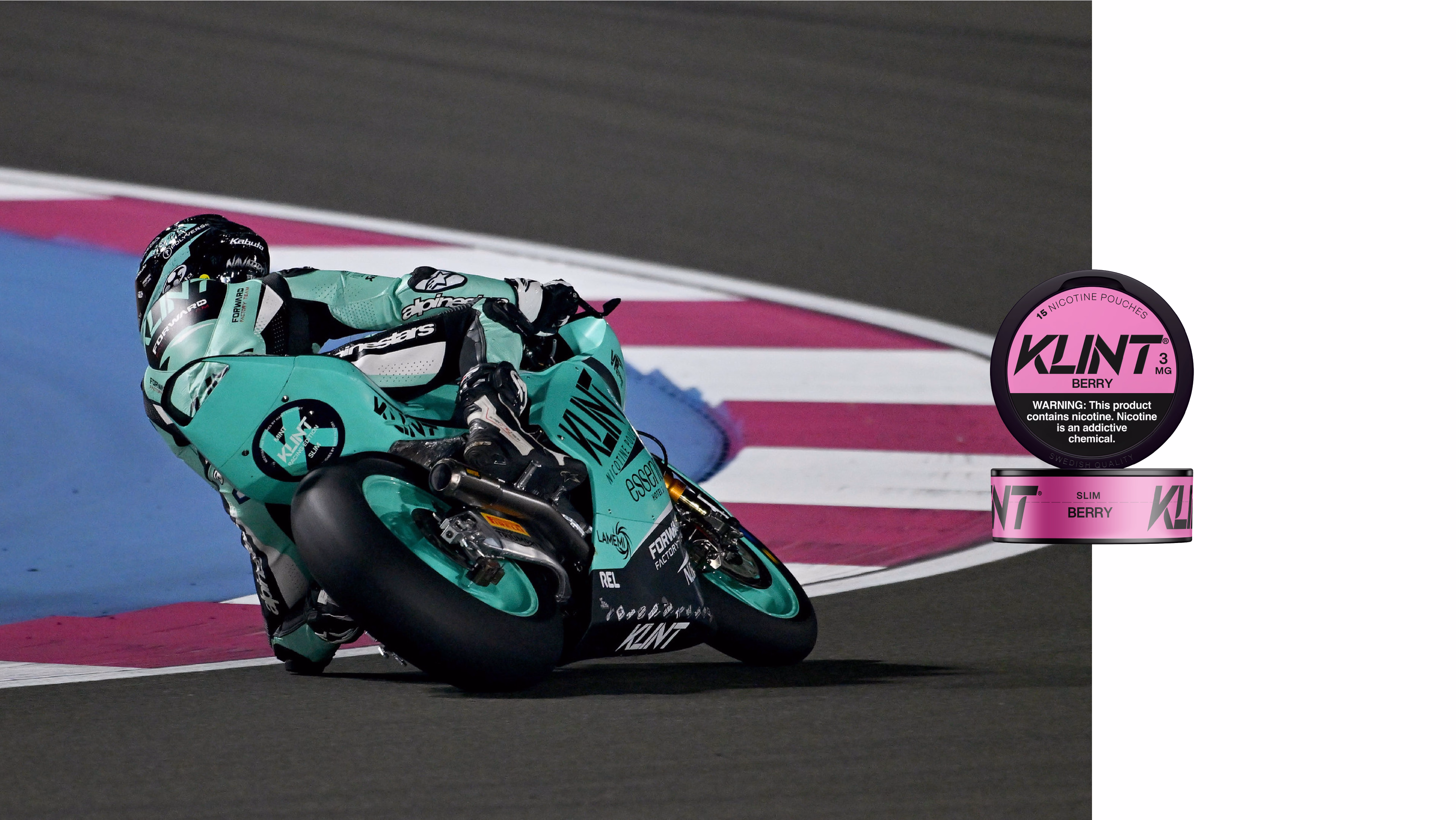
For racing events, we created a dedicated Racing Edition: a bold, mint-green and black can with zero nicotine, designed for visibility, impact, and free distribution on the track.
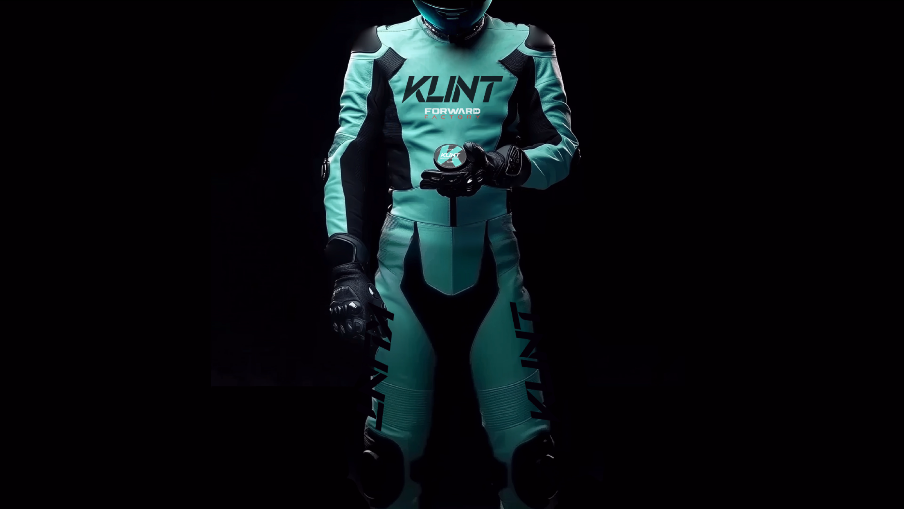
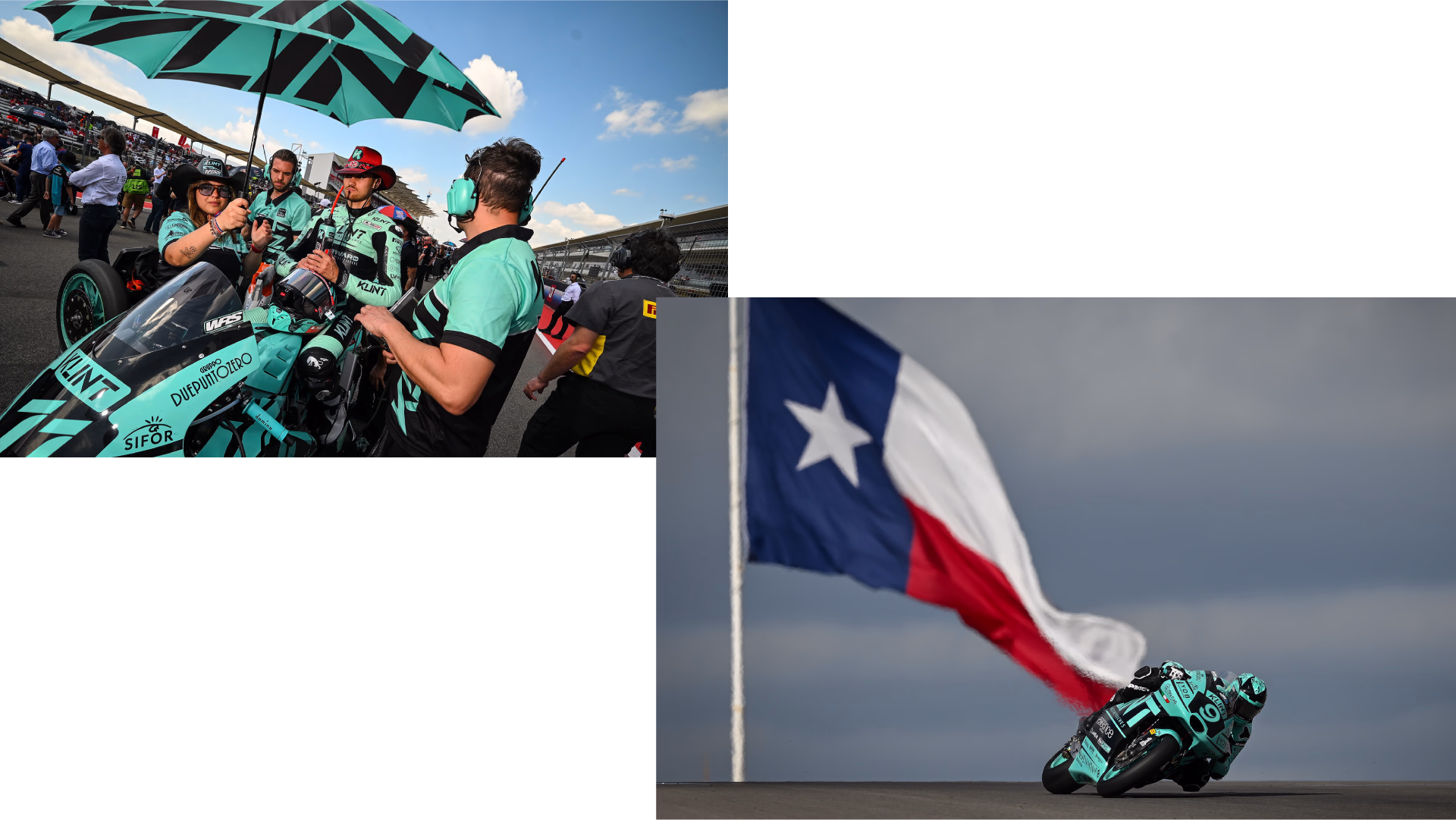
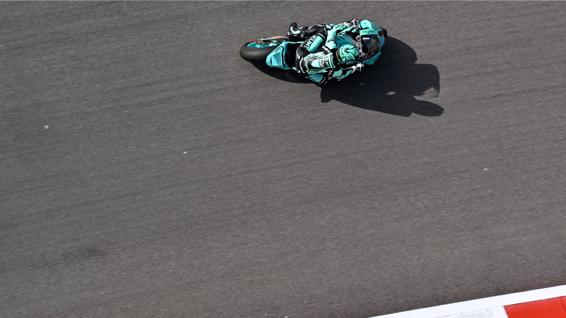
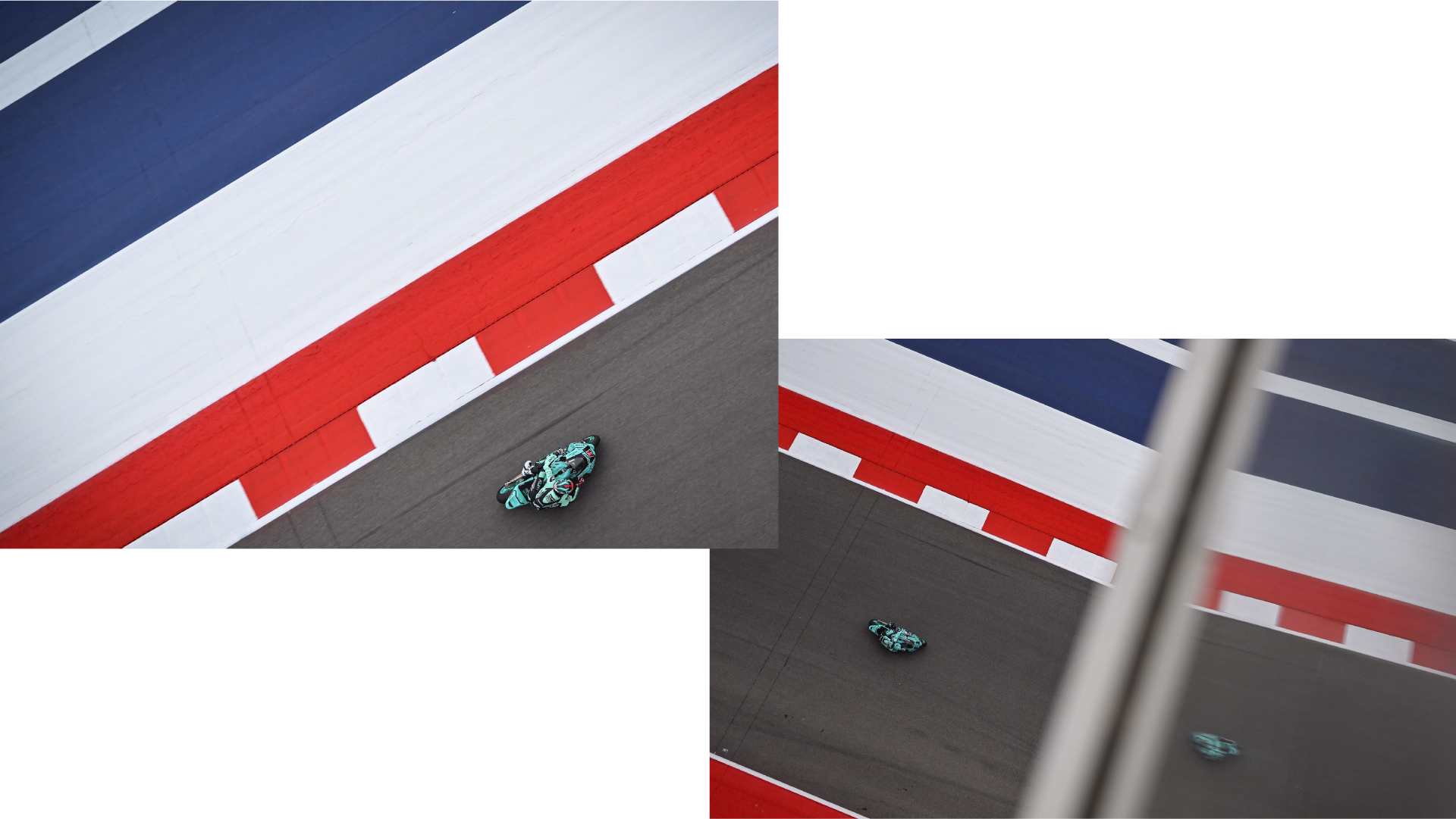
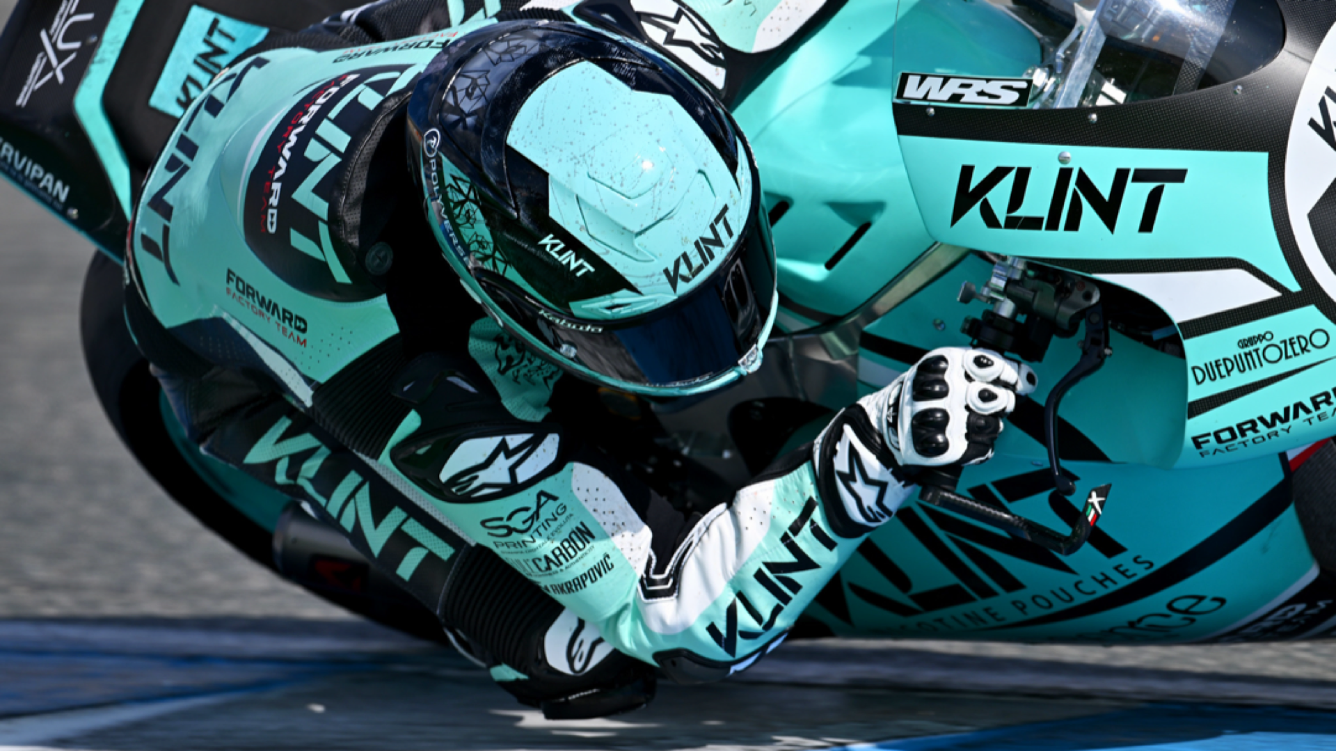
Tested at full speed
As the main sponsor of the Klint Forward Factory Moto2 team, Klint needed a visual identity that could hold its own at 300 km/h. The original wordmark was too light, too discreet – disappearing in the high-speed world of racing. Moto2 turned out to be a live test lab for bolder branding, and confirmed what was already clear: Klint needed to make a stronger impact, both on the track and on the shelf.
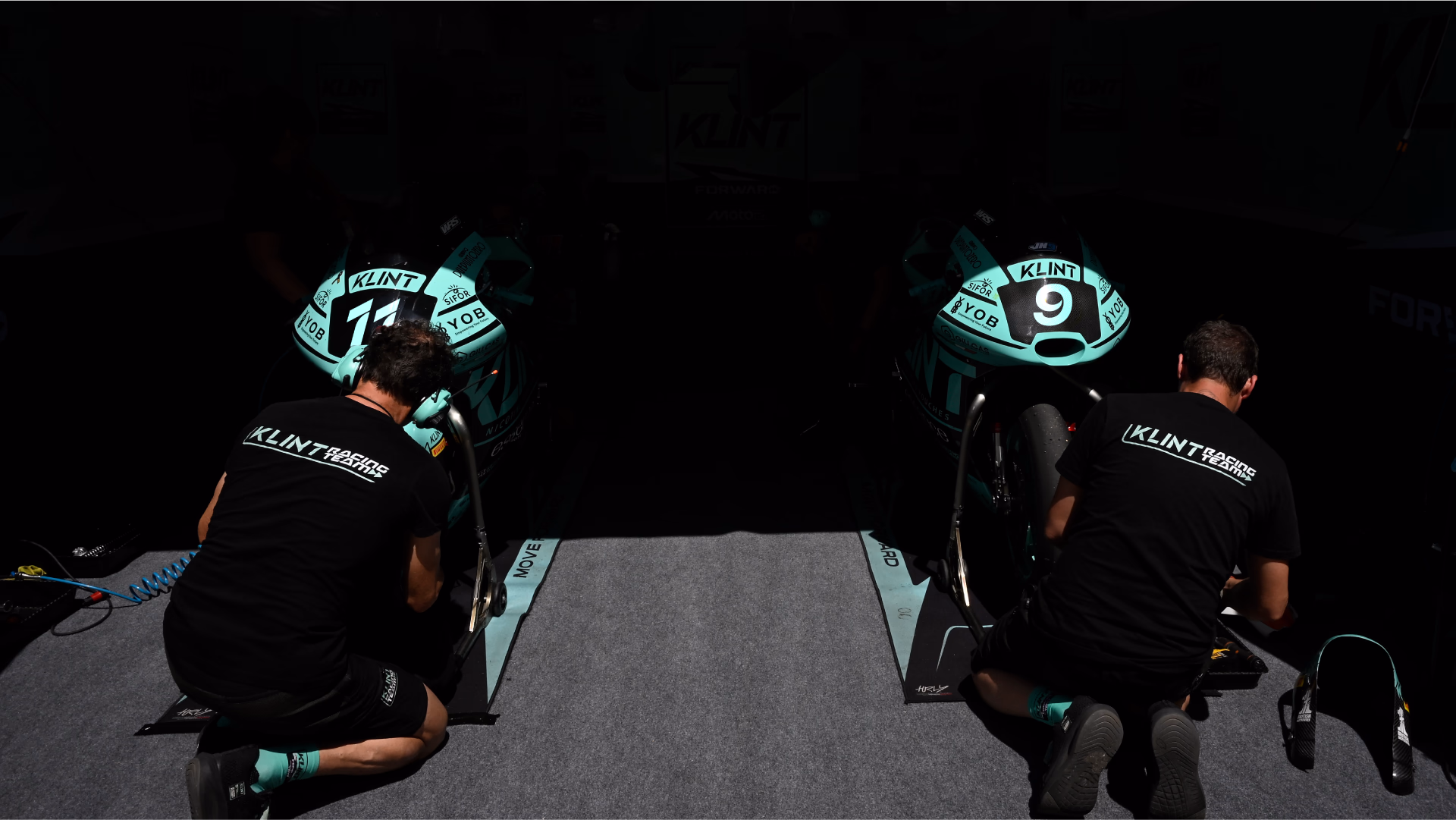
To ensure maximum visibility, Klint’s identity was carefully applied across every surface – from bikes to leathers and racing gear. Every placement was considered, every angle accounted for. A bold, unified presence developed by Neumeister.