Challenge[br] the ordinary
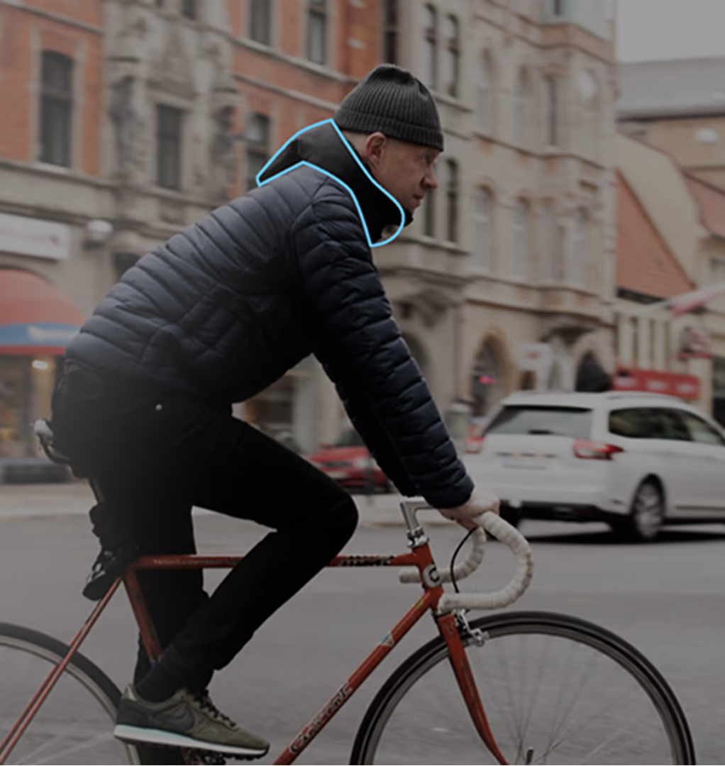
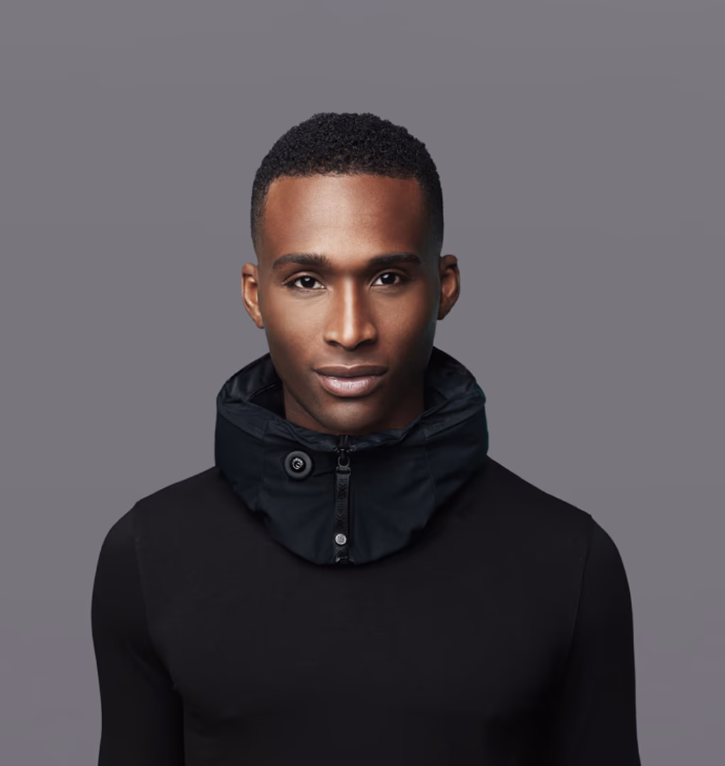
How do you make the invisible impossible to ignore? Hövding, the world’s first airbag for cyclists, was a game-changer – and it needed an identity to match. Neumeister’s mission? To create a brand strategy, visual identity, and packaging design that captured the brand’s innovation, passion, and compassion.
Project
Hövding Visual Identity
Client
Hövding
Assignment
Brand Strategy
Visual Identity
Packaging Design
Packaging Implementation
Reinventing [br]the helmet
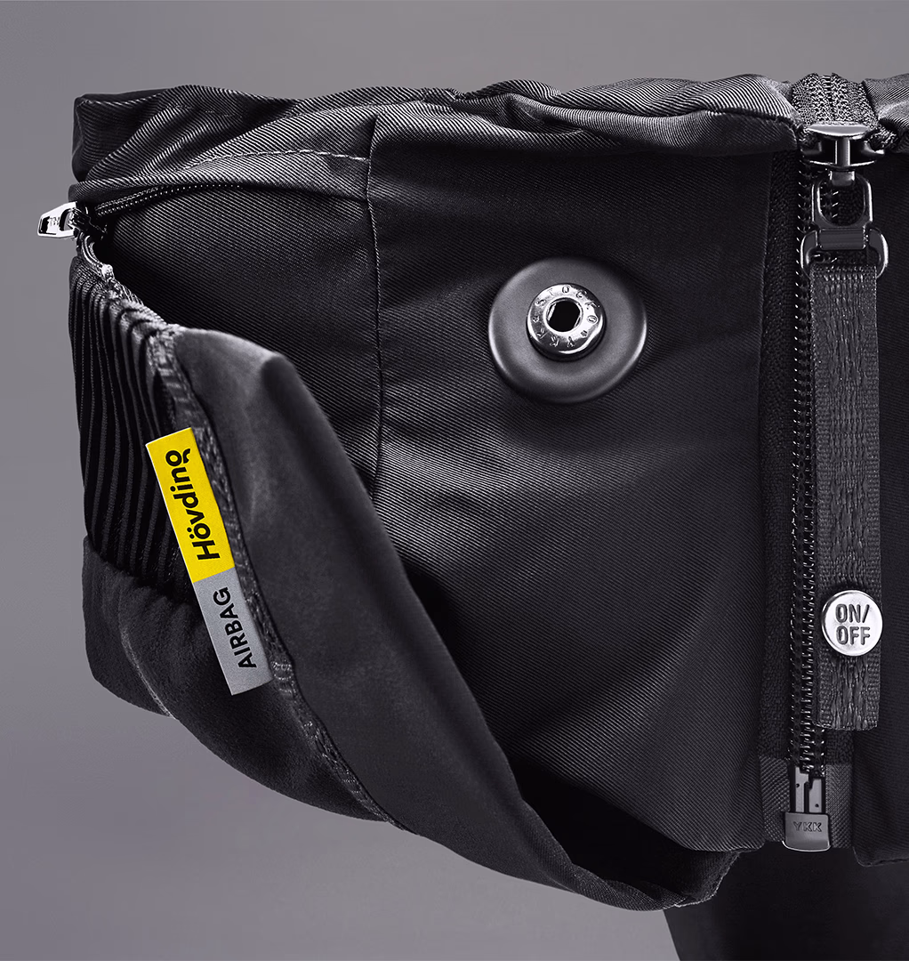
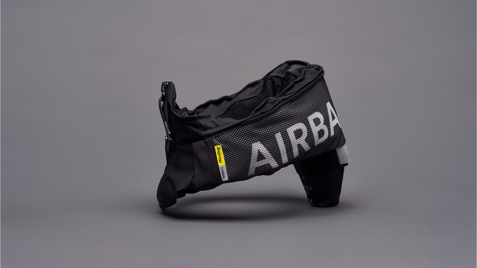
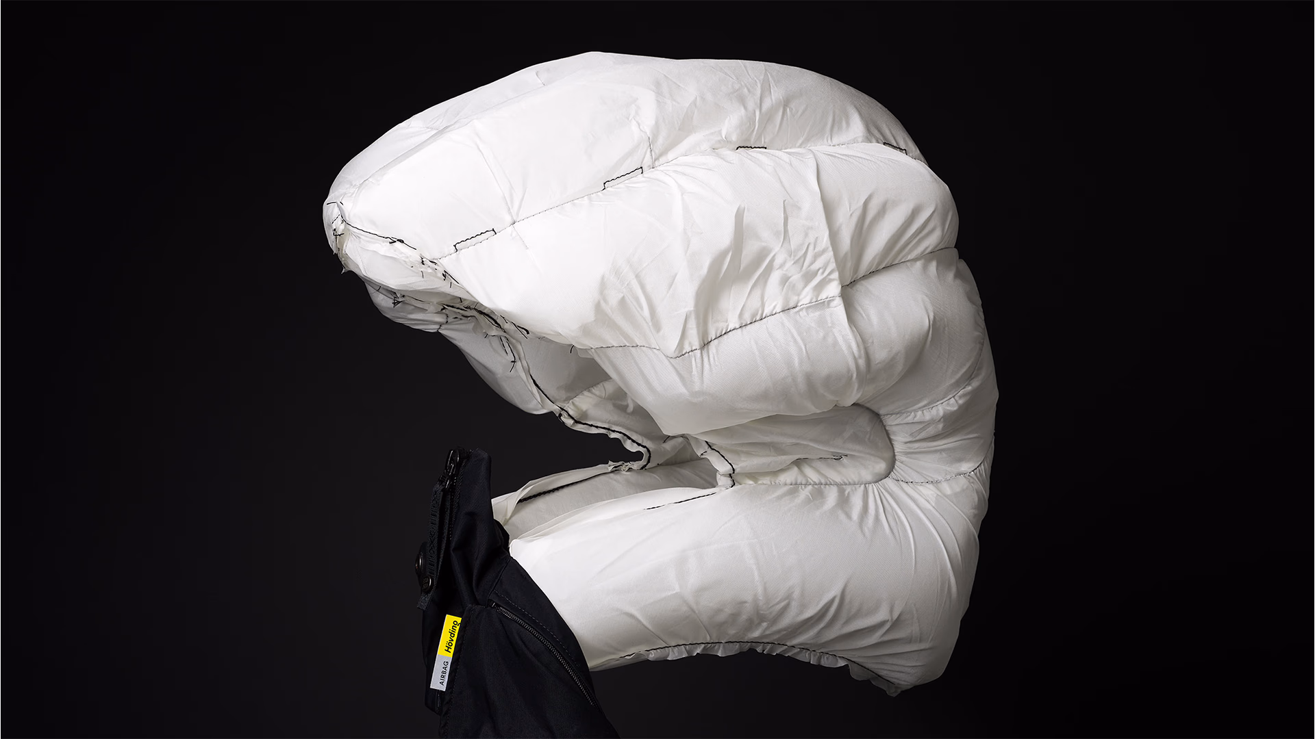
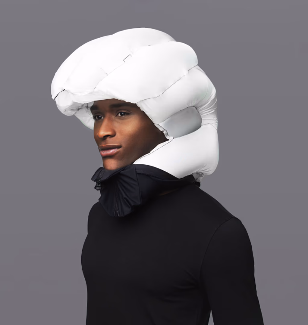
Hövding was the world’s first bicycle helmet with a built-in airbag. Swedish industrial design students Anna and Terese set out to create a helmet that urban cyclists would actually want to wear – and wear with a smile. From day one, their motto was ‘omöjligt triggar’ – or, in English, ‘nothing is impossible’.
Navigating with confidence
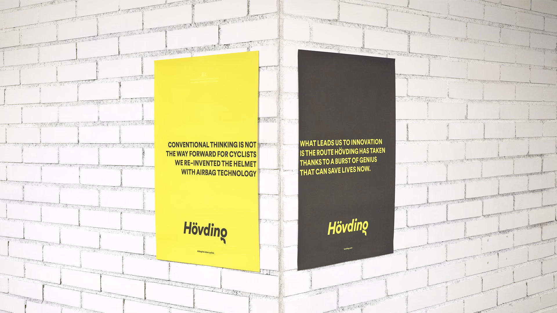
With a product so groundbreaking, sparking debate and even division amongst cyclists and safety proponents alike, an appropriate palette was required for Hövding’s brazen voyage into a sea of naysayers and doubters. Inspiration was taken from warning marks found on roads, bold yellow diagonal stripes cutting across stretches of black asphalt, signalling for traffic to keep out. This palette was fundemental in the creation a highly distinct and recognisable brand, and befitting of a product used predominently by urban cyclists.
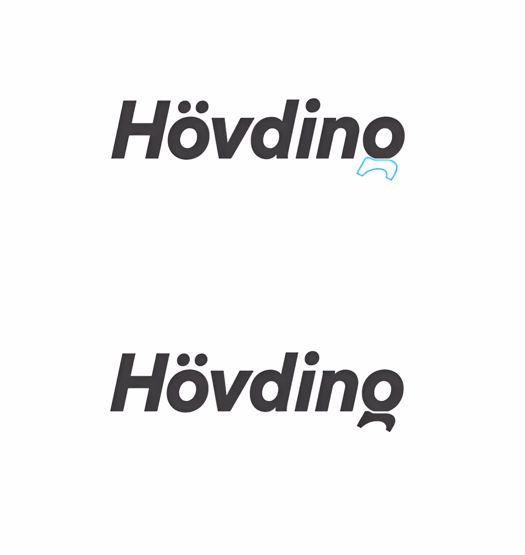
Bold and geometric, the typeface conveys confidence and reliability. The italicized letters create a sense of forward motion, while the lowercase “g” subtly resembles a head with a Hövding airbag around a cyclist’s neck — an understated nod to the product itself.
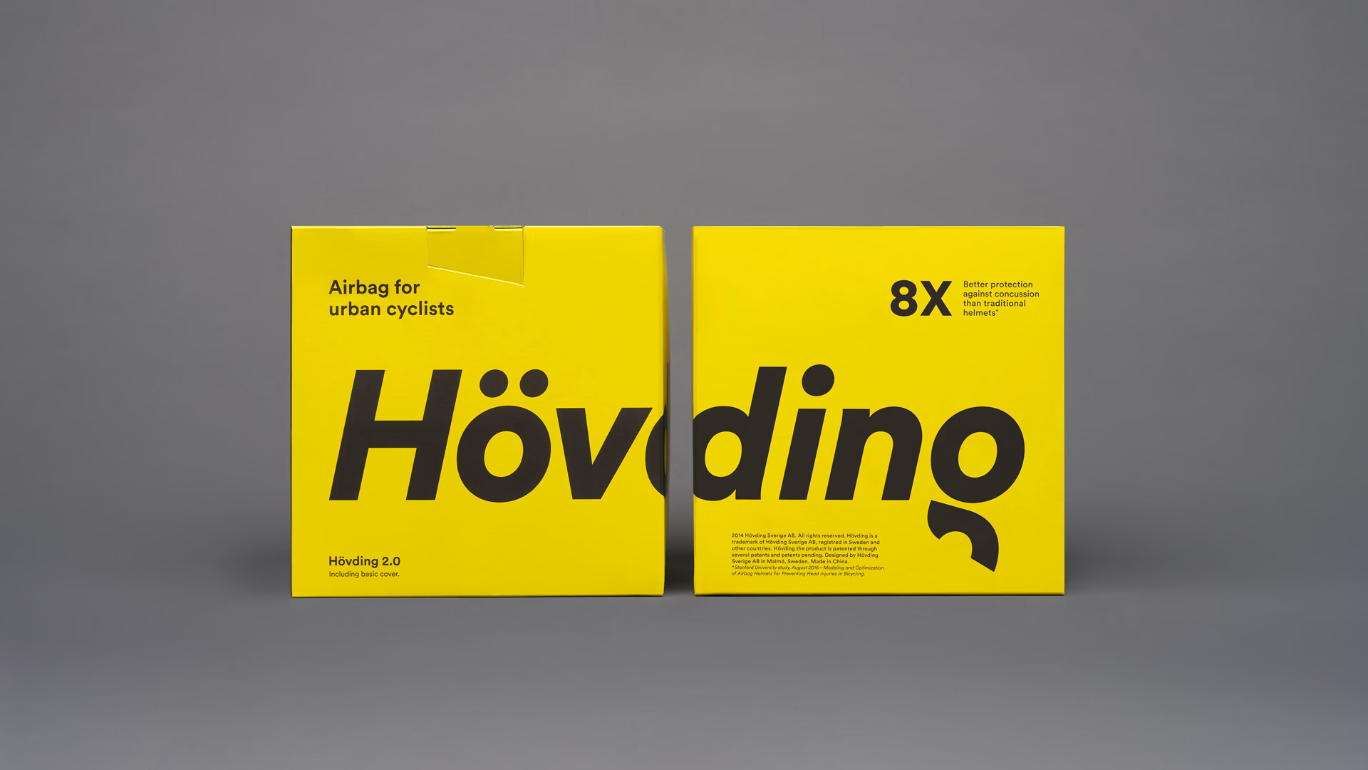
Twice the impact
The cut wordmark runs across two packages, locking them together. The result? Double impact and double presence on the shelf. Key selling points are highlighted directly on the packaging – making the benefits impossible to miss.