Design[br]to disrupt
HealthyCo is on a mission to make the world a healthier place. With a wide range of affordable, delicious products free from added sugar, they’re challenging the giants of the food industry. Neumeister's task? To create a new brand strategy, a visual identity, and a packaging design that were as bold and disruptive as HealthyCo itself.
Project
HealthyCo Redesign
Client
HealthyCo
Assignment
Brand Strategy
Visual Identity
Packaging Design
Packaging Implementation
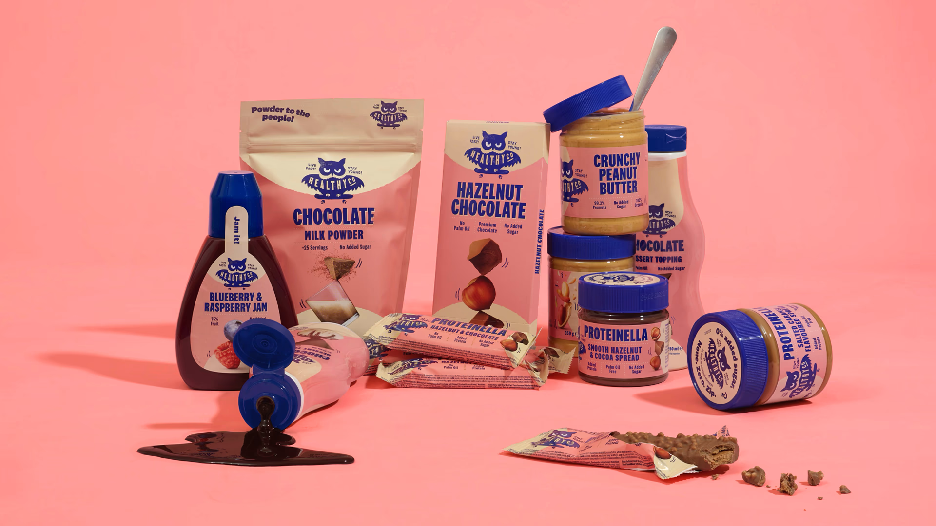
HealthyCo is redefining healthy eating with a range of products completely free from added sugar – and often organic. From beetroot juice and sesame oil to peanut butter and chocolate, their range proves that healthy doesn’t have to be boring. Found on grocery shelves across Sweden and exported to around 15 markets, HealthyCo is bringing better choices to tables worldwide.
Dare to be seen
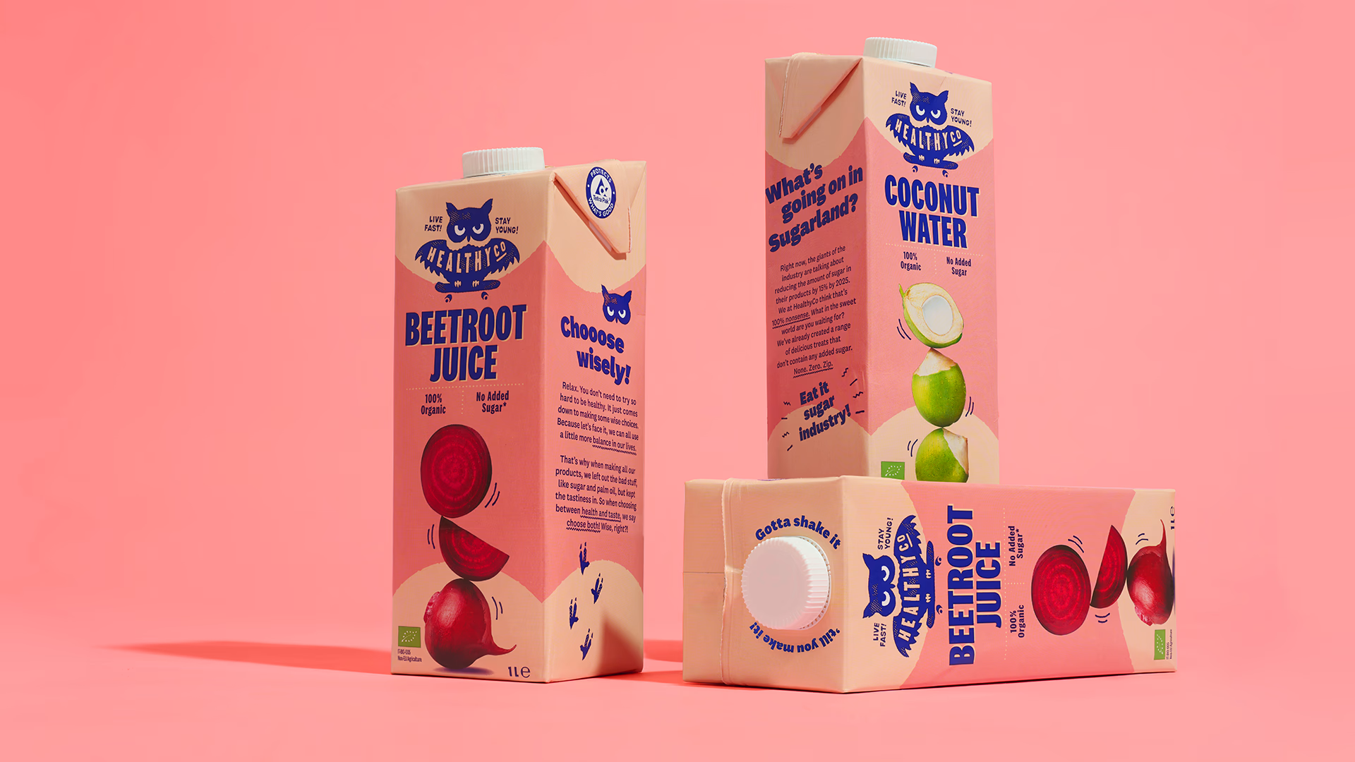
With products spread across multiple store sections, HealthyCo needed packaging that demanded attention. A bolt palette of pink, beige, and deep blue breaks the mold of typical grocery aisles, making the brand impossible to miss.

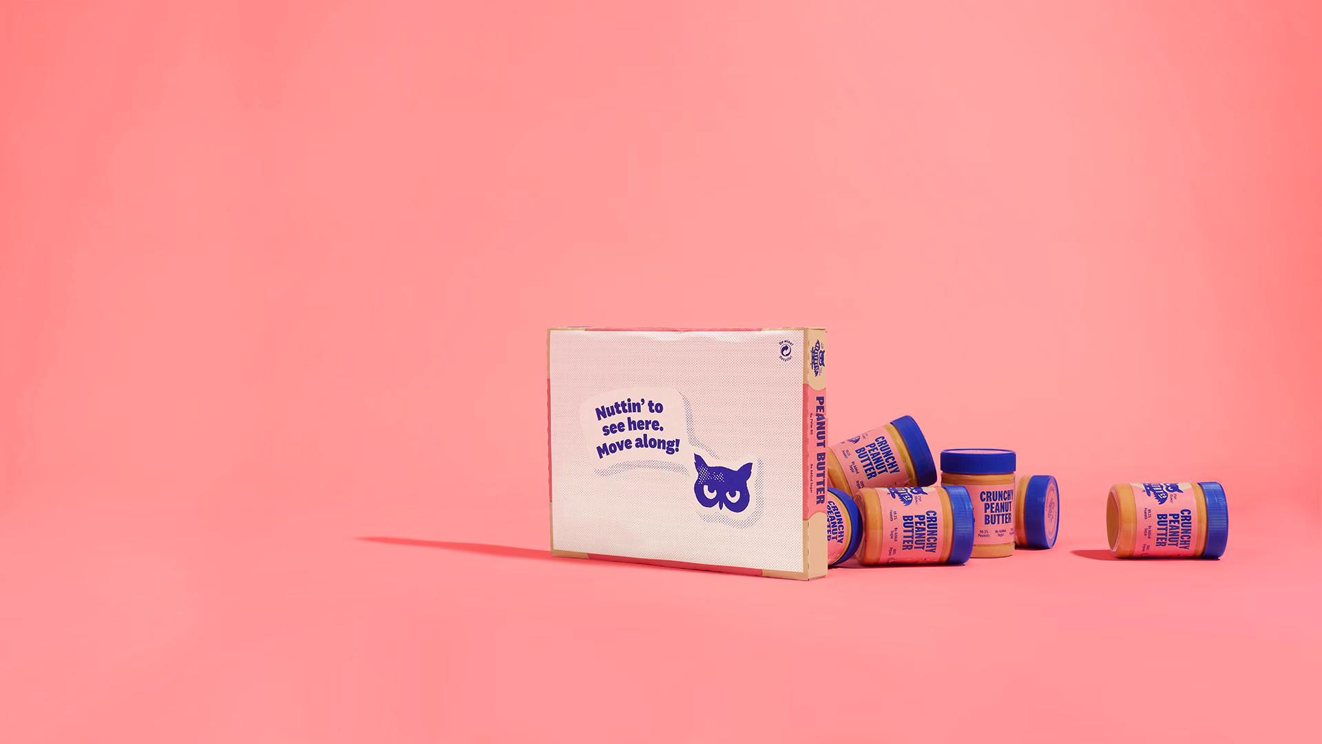
Hoot Hoot!
Forget the boring do’s and don’ts – HealthyCo’s motto "Live Fast! Stay Young!" shows that staying healthy and sustainable can be a thrill. The wise yet rebellious owl, cruising through life on a skateboard, became the symbol of HealthyCo’s relaxed and enjoyable lifestyle.
Flavours in focus
Bold, easy-to-read typography combined with striking flavour images ensures that customers can quickly find the right product. The composition itself signals balance – a core value that HealthyCo proudly embraces and shares with its consumers.
Playful messages like “Gotta shake it till you make it!”, “Choooose wisely!” and “Nuttin’ to see here! Move along!” boost the cheerful, carefree vibe on packaging and in store displays. Small details that bring a smile.