Order [br]in complexity
With a presence in over 100 countries, EF needed more than a facelift. The challenge was to refine the identity and bring order to a sprawling brand structure. Neumeister’s solution: a flexible system that connects the whole while letting each branch stand out.
Project
EF Visual Identity
Client
EF (Education First)
Assignment
Visual Identity
Implementation
EF Education First is a global education company, known for language learning, cultural exchange and international study. From its headquarters in Lucerne, Switzerland, EF launched an international pitch to find a partner for a major brand overhaul. The brief landed at Neumeister – a vote of confidence from an organisation with a truly global reach.

An icon untouched
EF’s logo, created by legendary designer Paul Rand, is as close to untouchable as a design element gets. Rather than redraw an icon, Neumeister chose to leave it exactly as it was – focusing instead on building a stronger, more cohesive identity around it.
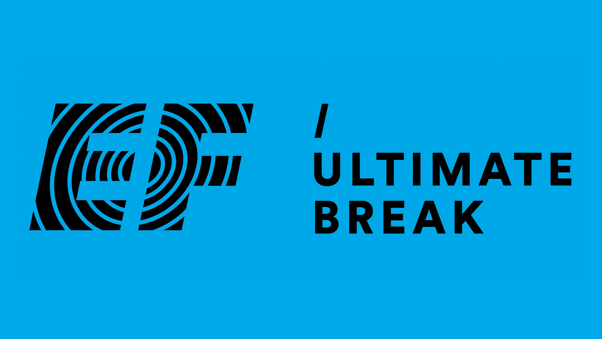
At the heart of EF’s refreshed identity is a single, striking element: the forward slash. Tilted forward, it conveys energy and movement while serving a clear purpose – to link the master brand with its many business areas. Simple, distinctive and easy to use, it’s a unifying symbol designed to work seamlessly across markets and channels.
Not just a logo.[br] It’s a mindset.
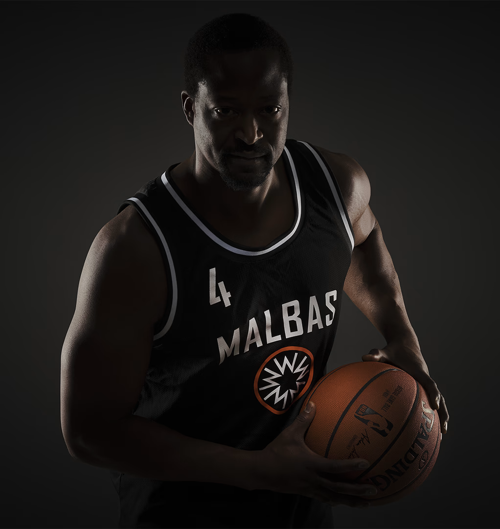
Five players, five M’s – each representing the individuals on the court. In the logo, the M’s lock together, forming a star – a bold statement of what this club stands for: teamwork makes the dream work. Framed by an orange circle, the star transforms into something every fan knows by heart – a hoop seen from above. A mark of unity, passion, and pure love for the game.

At a time when red and blue dominated the court, we chose black – a colour Malbas could truly own. It brings a presence that stands out without shouting. And as a backdrop to the orange circle behind the M’s, it creates contrast, clarity and character. The typeface – a customised cut of a classic sports font – adds edge and confidence to every word.
More street than sweet
We built the identity with inspiration from American basketball culture – where street energy meets NBA flair. The aim was never to feel typically Swedish, but to channel grit, confidence, and presence. In Malmö, a city marked by contrast and toughness, Malbas offers something more than sport. A sense of belonging. A choice. And a symbol to stand behind – on and off the court.

