Where logic meets magic.
Where rules meet rebellion.
Where reason meets wonder.
Where logic meets magic.
Where rules meet rebellion.
Where reason meets wonder.
Where logic meets magic.
Where rules meet rebellion.
Where reason meets wonder.
Where logic meets magic.
Where rules meet rebellion.
Where reason meets wonder.
Where logic meets magic.
Where rules meet rebellion.
Where reason meets wonder.
Where logic meets magic.
Where rules meet rebellion.
Where reason meets wonder.
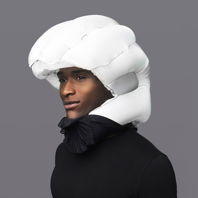
Oddnorm
A pop-up that refuses to behave. For Oddnorm — the Nordics’ first full-sensory dining experiment, Neumeister has created an identity sharpened with intent: bold, ambiguous and deliberately asymmetric. A visual system that twists the familiar into something thrillingly unknown.

Finch
Finch combines artificial intelligence, graph technology and advanced algorithms to optimise and streamline the design process for architects. The goal? Smarter decisions, made faster. Neumeister’s task was to build the brand from the ground up – creating a visual identity as dynamic, forward-thinking and precise as the software itself.
Two Days in Monte Carlo
In 1967, the photographer Sture Lindvall documented the 25th Monaco Grand Prix in Monte Carlo. The result is an astonishing portrait of Formula One at its tipping point; 1967 was the last year before sponsorship was fully established and the world of Formula One was forever changed.
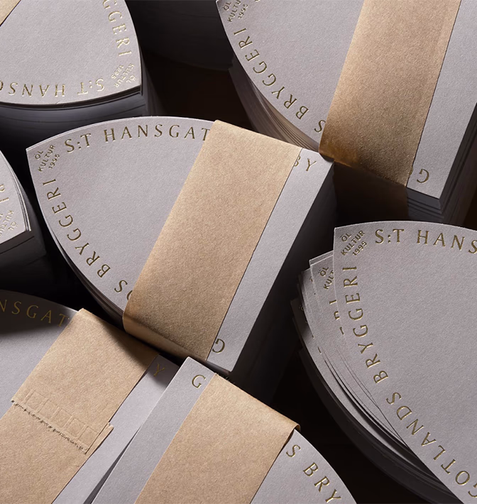
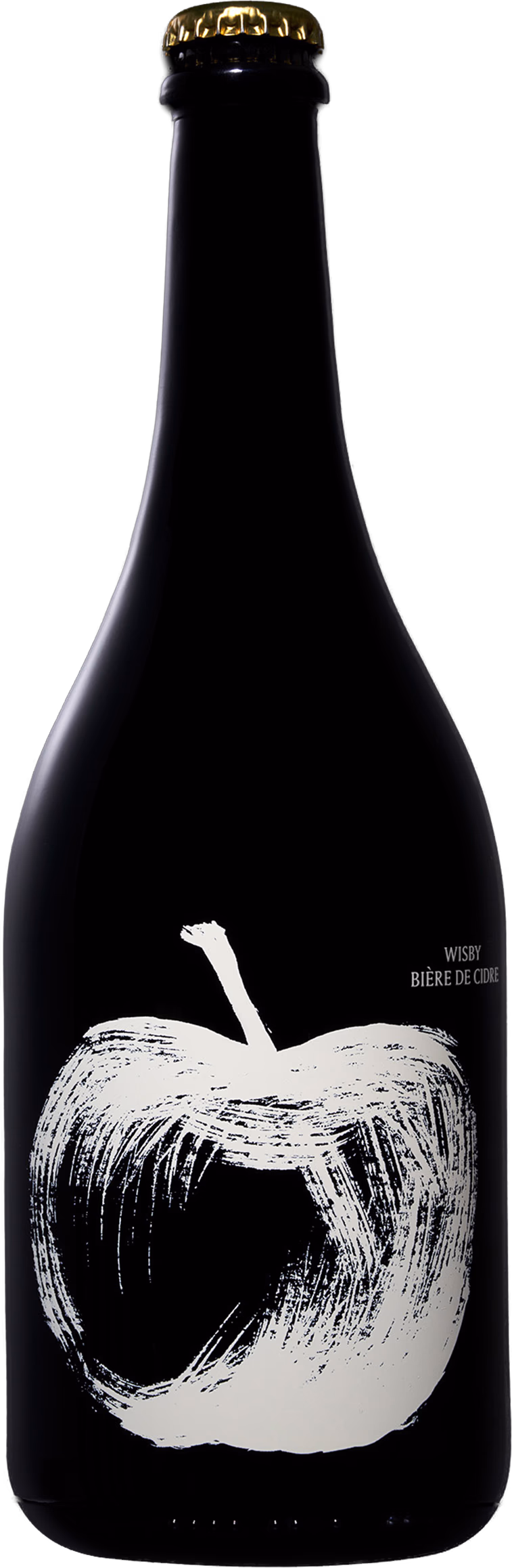
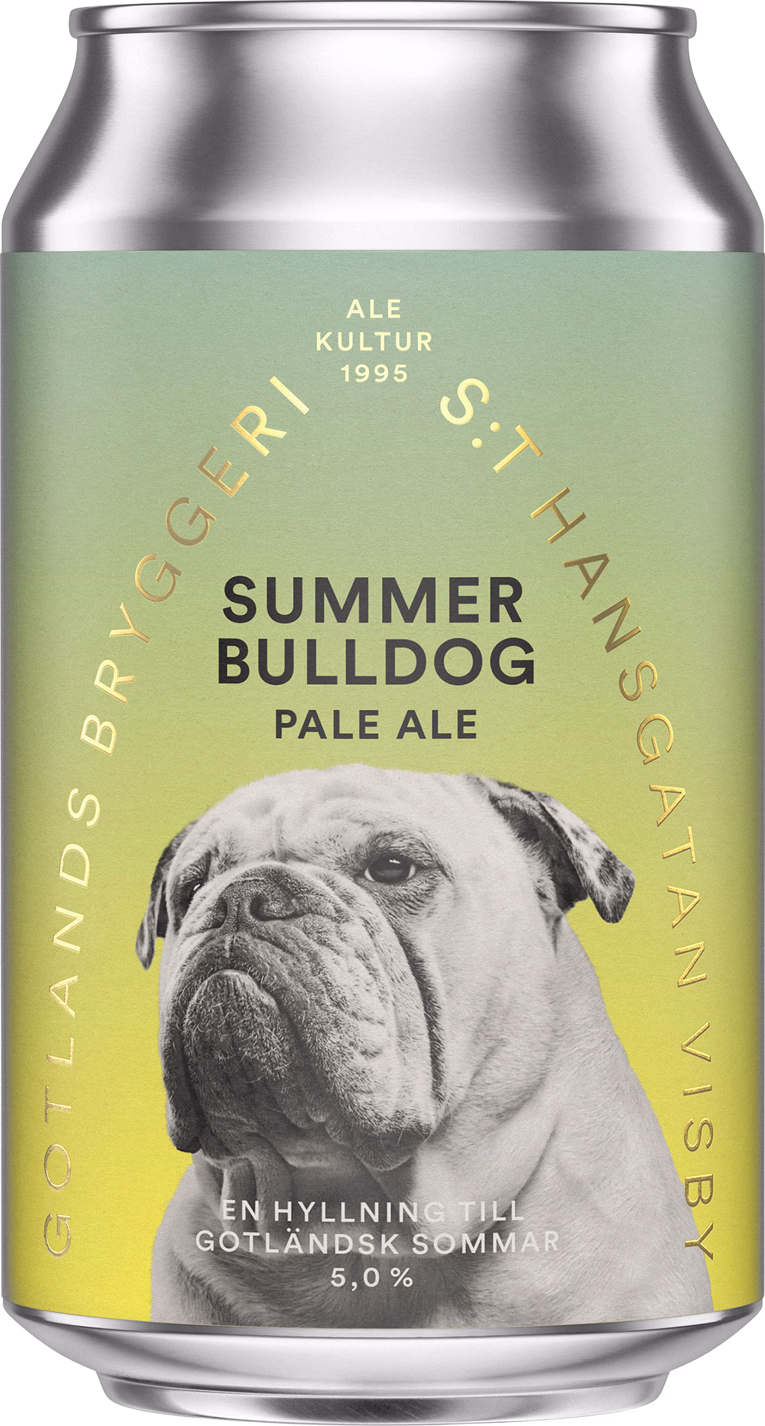
Gotlands Bryggeri
Craft beer from Gotlands Bryggeri. An homage to draught, tradition, and small-scale brewing. With two copper kettles and an abundance of ideas, Gotlands Bryggeri produces some of Sweden’s most beloved beers.
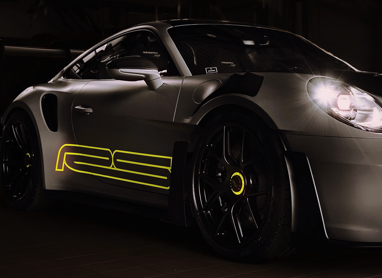
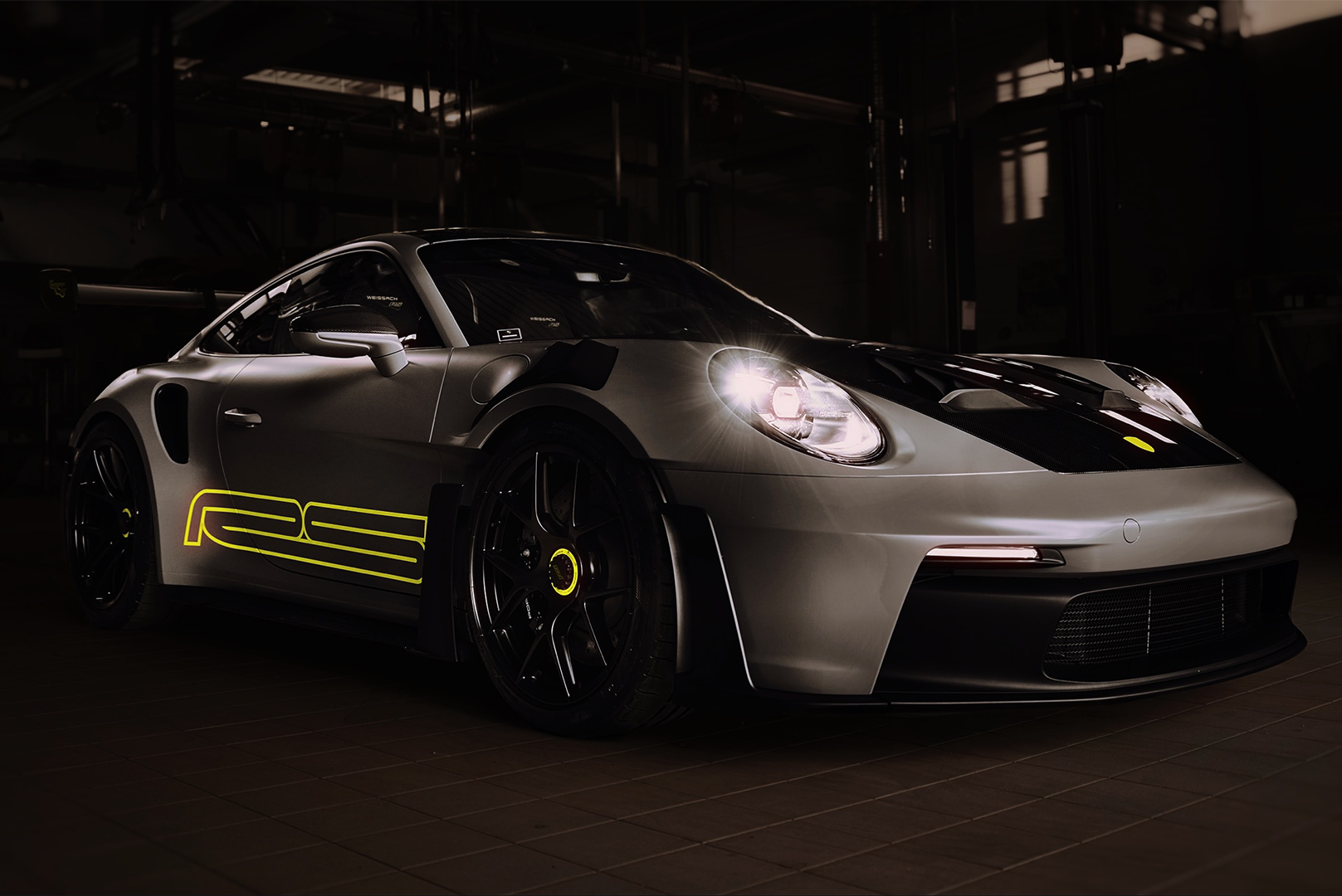
NeuType RS
The Porsche 911 GT3 RS is designed to do one thing: turn engineering into speed. Its surfaces, cuts and wing profiles work together with uncompromising clarity. Our RS typeface captures that same energy. A modern, track-born expression where motion, precision and control form the backbone of every letter.
We work with courageous companies who share our vision of creating strong, efficient and relevant brands that outlive ourselves.